vue-element-admin
:tada: A magical vue admin https://panjiachen.github.io/vue-element-admin
- 90k
- Vue
- MIT
- 2 y ago
Enterprise UI Components - Grid, Scheduler, Gantt, Kanban & more. Works with Angular, React, NextJS, Vue, Vanilla Javascript and .NET Blazor
Repo HTMLElements/Smart.UI, read from GitHub 1 min ago. HTMLElements has not joined Take My Repo.
HTMLElements/Smart.UI is a public repo on GitHub by HTMLElements. Enterprise UI Components - Grid, Scheduler, Gantt, Kanban & more. Works with Angular, React, NextJS, Vue, Vanilla Javascript and .NET Blazor. It declares no license on GitHub. Public does not mean open source: without a license, nobody is granted the right to reuse it. It is written mainly in CSS, has 486 stars and last changed on 2026-11-15. Nobody has reviewed it on Take My Repo yet, which says nothing about its quality. Read from GitHub on 2026-11-21.
Enterprise-ready UI components for Angular, React, Vue, Blazor, and Vanilla JS — Build dashboards, data-heavy apps, and complex interfaces faster.
Cross-Framework: Angular, React, Vue, Blazor, and plain JS. Feature-Rich & Enterprise-Ready: Components not easily found in free libraries. Easy Integration: Clear documentation, demos, and framework-specific examples. Lightweight & Modular: Import only the components you need.
Install from npm:
# JavaScript
npm install smart-webcomponents

# Angular
npm install smart-webcomponents-angular

Install specific component:
npm install @smart-webcomponents-angular/grid

# React
npm install smart-webcomponents-react

# Vue
npm install smart-webcomponents
<!DOCTYPE html>
<html>
<head>
  <link rel="stylesheet" type="text/css" href="smart-webcomponents/source/styles/smart.default.css" />
  <script type="module">
    import 'smart-webcomponents/source/modules/smart.grid.js';

    window.onload = function() {
      const grid = document.querySelector('smart-grid');
      grid.dataSource = [
        { id: 1, product: 'Laptop', price: 1200 },
        { id: 2, product: 'Phone', price: 800 }
      ];
      grid.columns = [
        { label: 'ID', dataField: 'id', width: 50 },
        { label: 'Product', dataField: 'product' },
        { label: 'Price', dataField: 'price', cellsFormat: 'c2' }
      ];
    };
  </script>
</head>
<body>
  <smart-grid sortable filterable editable id="grid"></smart-grid>
</body>
</html>
// app.component.ts
 import { Component, ViewChild, AfterViewInit, ViewEncapsulation } from '@angular/core';
import { GridComponent, GridColumn, DataAdapter, Smart } from 'smart-webcomponents-angular/grid';

import { CommonModule } from '@angular/common';
import { RouterOutlet } from '@angular/router';
import { GridModule } from 'smart-webcomponents-angular/grid';

@Component({
    selector: 'app-root',
	standalone: true,
	imports: [CommonModule, GridModule, RouterOutlet],
    template: '<smart-grid  [dataSource]="dataSource" [columns]="columns" #grid></smart-grid>',
    styleUrls: ['app.component.css'],
    encapsulation: ViewEncapsulation.None
})

export class AppComponent implements AfterViewInit {
	@ViewChild("grid", { read: GridComponent, static: false }) grid!: GridComponent;

	dataSource: any[] = [
		  { "firstName": "Beate", "lastName": "Wilson", "productName": "Caramel Latte"},
		  { "firstName": "Ian", "lastName": "Nodier", "productName": "Caramel Latte"},
		  { "firstName": "Petra", "lastName": "Vileid", "productName": "Green Tea"},
		  { "firstName": "Mayumi", "lastName": "Ohno", "productName": "Caramel Latte"},
		  { "firstName": "Mayumi", "lastName": "Saylor", "productName": "Espresso con Panna"},
		  { "firstName": "Regina", "lastName": "Fuller", "productName": "Caffe Americano" },
		  { "firstName": "Regina", "lastName": "Burke", "productName": "Caramel Latte"},
		  { "firstName": "Andrew", "lastName": "Petersen", "productName": "Caffe Americano"},
		  { "firstName": "Martin", "lastName": "Ohno", "productName": "Espresso con Panna"},
		  { "firstName": "Beate", "lastName": "Devling", "productName": "Green Tea"},
		  { "firstName": "Sven", "lastName": "Devling", "productName": "Espresso Truffle"},
		  { "firstName": "Petra", "lastName": "Burke", "productName": "Peppermint Mocha Twist"},
		  { "firstName": "Marco", "lastName": "Johnes", "productName": "Caffe Mocha"}
	]

	columns: GridColumn[] = [{
			label: 'First Name',
			dataField: 'firstName'
		},
		{
			label: 'Last Name',
			dataField: 'lastName'
		},
		{
			label: 'Product',
			dataField: 'productName'
		}
	];


    ngAfterViewInit(): void {

    }
}
import 'smart-webcomponents-react/source/styles/smart.default.css';
import { Smart, Grid } from 'smart-webcomponents-react/grid';

function App() {

	const behavior = {
		columnResizeMode: 'growAndShrink'
	}

	const appearance = {
		alternationCount: 2,
		showRowHeader: true,
		showRowHeaderSelectIcon: true,
		showRowHeaderFocusIcon: true
	}

	const paging = {
		enabled: true
	}

	const pager = {
		visible: true
	}

	const sorting = {
		enabled: true
	}

	const editing = {
		enabled: true
	}

	const selection = {
		enabled: true,
		allowCellSelection: true,
		allowRowHeaderSelection: true,
		allowColumnHeaderSelection: true,
		mode: 'extended'
	}

	const dataSourceSettings = {
		dataFields: [
			'firstName: string',
			'lastName: string',
			'productName: string'
		]
	}

	const dataSource = [
		  { "firstName": "Beate", "lastName": "Wilson", "productName": "Caramel Latte"},
		  { "firstName": "Ian", "lastName": "Nodier", "productName": "Caramel Latte"},
		  { "firstName": "Petra", "lastName": "Vileid", "productName": "Green Tea"},
		  { "firstName": "Mayumi", "lastName": "Ohno", "productName": "Caramel Latte"},
		  { "firstName": "Mayumi", "lastName": "Saylor", "productName": "Espresso con Panna"},
		  { "firstName": "Regina", "lastName": "Fuller", "productName": "Caffe Americano" },
		  { "firstName": "Regina", "lastName": "Burke", "productName": "Caramel Latte"},
		  { "firstName": "Andrew", "lastName": "Petersen", "productName": "Caffe Americano"},
		  { "firstName": "Martin", "lastName": "Ohno", "productName": "Espresso con Panna"},
		  { "firstName": "Beate", "lastName": "Devling", "productName": "Green Tea"},
		  { "firstName": "Sven", "lastName": "Devling", "productName": "Espresso Truffle"},
		  { "firstName": "Petra", "lastName": "Burke", "productName": "Peppermint Mocha Twist"},
		  { "firstName": "Marco", "lastName": "Johnes", "productName": "Caffe Mocha"}
	]

	const columns = [{
		label: 'First Name',
		dataField: 'firstName'
	},
	{
		label: 'Last Name',
		dataField: 'lastName'
	},
	{
		label: 'Product',
		dataField: 'productName'
	}
	]

	return (
		<div>
			<Grid
				dataSourceSettings={dataSourceSettings}
				dataSource={dataSource}
				columns={columns}
				appearance={appearance}
				behavior={behavior}
				selection={selection}
				paging={paging}
				pager={pager}
				sorting={sorting}
				editing={editing}
			>
			</Grid>
		</div>
	);
}

export default App;
<template>
  <div class="vue-root">
    <div class="demo-description">
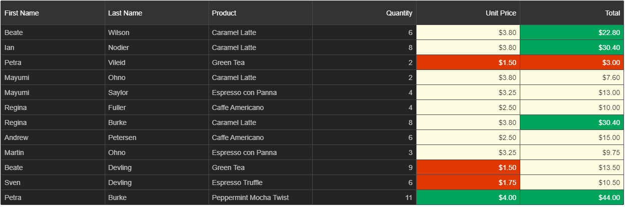
      The Grid in this demo displays data in a series of rows and columns. This
      is the simplest case when the Grid is bound to a local data source.
    </div>
    <smart-grid id="grid"></smart-grid>
  </div>
</template>

<script>
import { onMounted } from "vue";
import "smart-webcomponents/source/styles/smart.default.css";
import "smart-webcomponents/source/modules/smart.grid.js";

export default {
  name: "app",
  setup() {
    onMounted(() => {
      window.Smart(
        "#grid",
        class {
          get properties() {
            return {
              behavior: {
                columnResizeMode: "growAndShrink"
              },
              appearance: {
                alternationCount: 2,
                showRowHeader: true,
                showRowHeaderSelectIcon: true,
                showRowHeaderFocusIcon: true
              },
              paging: {
                enabled: true
              },
              pager: {
                visible: true
              },
              sorting: {
                enabled: true
              },
              editing: {
                enabled: true
              },
              selection: {
                enabled: true,
                allowCellSelection: true,
                allowRowHeaderSelection: true,
                allowColumnHeaderSelection: true,
                mode: "extended"
              },
              dataSource: [
				  { "firstName": "Beate", "lastName": "Wilson", "productName": "Caramel Latte"},
				  { "firstName": "Ian", "lastName": "Nodier", "productName": "Caramel Latte"},
				  { "firstName": "Petra", "lastName": "Vileid", "productName": "Green Tea"},
				  { "firstName": "Mayumi", "lastName": "Ohno", "productName": "Caramel Latte"},
				  { "firstName": "Mayumi", "lastName": "Saylor", "productName": "Espresso con Panna"},
				  { "firstName": "Regina", "lastName": "Fuller", "productName": "Caffe Americano" },
				  { "firstName": "Regina", "lastName": "Burke", "productName": "Caramel Latte"},
				  { "firstName": "Andrew", "lastName": "Petersen", "productName": "Caffe Americano"},
				  { "firstName": "Martin", "lastName": "Ohno", "productName": "Espresso con Panna"},
				  { "firstName": "Beate", "lastName": "Devling", "productName": "Green Tea"},
				  { "firstName": "Sven", "lastName": "Devling", "productName": "Espresso Truffle"},
				  { "firstName": "Petra", "lastName": "Burke", "productName": "Peppermint Mocha Twist"},
				  { "firstName": "Marco", "lastName": "Johnes", "productName": "Caffe Mocha"}
				],
              columns: [
                {
                  label: "First Name",
                  dataField: "firstName"
                },
                {
                  label: "Last Name",
                  dataField: "lastName"
                },
                {
                  label: "Product",
                  dataField: "productName"
                }
              ]
            };
          }
        }
      );
    });
  }
};
</script>

<style>
body {
  min-height: 700px;
}

smart-grid {
  width: 100%;
  height: auto;
}
</style>
@page "/grid-example"
@using Smart.Blazor

<Grid DataSource="dataSource" Columns="columns"></Grid>

@code {
    public object[] dataSource = new object[]
    {
        new { id = 1, product = "Laptop", price = 1200 },
        new { id = 2, product = "Phone", price = 800 }
    };

    public object[] columns = new object[]
    {
        new { label = "ID", dataField = "id", width = 50 },
        new { label = "Product", dataField = "product" },
        new { label = "Price", dataField = "price", cellsFormat = "c2" }
    };
}
We welcome feedback, issues, and pull requests!
Open to bug reports, documentation fixes, demo contributions
Please see our contribution guidelines.
This project is licensed under the Commercial License.
See LICENSE for more information.
💡 Smart.UI Component Library help you build applications that look modern, feel responsive, and scale with your needs.
HTMLElements/Smart.UI is a public repo on GitHub by HTMLElements. Enterprise UI Components - Grid, Scheduler, Gantt, Kanban & more. Works with Angular, React, NextJS, Vue, Vanilla Javascript and .NET Blazor.
It declares no license on GitHub. Public does not mean open source: without a license, nobody is granted the right to reuse it.
Its maker has not tagged a system, so it is unknown here. Its README says what it needs.
Open "Take it" on its page: Take My Repo writes an install plan for your machine and hands it to your AI agent (Claude Code, Codex or Cursor), which asks you before each step. Take My Repo has not tested it on any machine.
Its last change on GitHub was on 2026-11-15. Take My Repo does not judge from that whether it is maintained.
Nobody has reviewed it on Take My Repo yet, which says nothing about its quality.
:tada: A magical vue admin https://panjiachen.github.io/vue-element-admin
Turn Claude Code into a full game dev studio — 49 AI agents, 75 workflow skills, and a complete coordination system mirroring real studio hierarchy.
Flutter makes it easy and fast to build beautiful apps for mobile and beyond
f.k.a. Awesome ChatGPT Prompts. Share, discover, and collect prompts from the community. Free and open source — self-host for your organization with complete privacy.