rea
Reverse engineer anything with agents, from app behavior down to native binaries.
- 471k
- TypeScript
- MIT
- 6 h ago
🚀🏞💪 Collection of Images, Modifiers, utility functions for Jetpack Compose to expand and enrich displaying, manipulating, scaling, resizing, zooming, and getting cropped ImageBitmap based on selection area
Repo SmartToolFactory/Compose-Image, read from GitHub 1 min ago. SmartToolFactory has not joined Take My Repo.
SmartToolFactory/Compose-Image is a public repo on GitHub by SmartToolFactory. 🚀🏞💪 Collection of Images, Modifiers, utility functions for Jetpack Compose to expand and enrich displaying, manipulating, scaling, resizing, zooming, and getting cropped ImageBitmap based on selection area. It declares the Apache-2.0 license on GitHub. It is written mainly in Kotlin, has 363 stars and last changed on 2026-03-23. Nobody has reviewed it on Take My Repo yet, which says nothing about its quality. Read from GitHub on 2026-11-20.
Collection of Images, Modifiers, utility functions for Jetpack Compose to expand
and enrich displaying, manipulating, scaling, resizing, zooming, and
getting cropped ImageBitmap based on selection area, before/after image to with handle to
show partial of both images and more is cooking up
To get a Git project into your build:
allprojects {
  repositories {
      ...
      maven { url 'https://jitpack.io' }
  }
}
dependencies {
    implementation 'com.github.SmartToolFactory:Compose-Image:<version>'
}
A composable that lays out and draws a given ImageBitmap. This will attempt to
size the composable according to the ImageBitmap's given width and height.
ImageScope returns constraints, width and height of the drawing area based on contentScale
and rectangle of imageBitmap drawn. When a bitmap is displayed scaled to fit area of Composable
space used for drawing image is represented with ImageScope.imageWidth and
ImageScope.imageHeight. When we display a bitmap 1000x1000px with ContentScale.Crop if it's
cropped to 500x500px ImageScope.rect returns IntRect(250,250,750,750).
This composable enables building other Image based Composables that require you to know
spaces around ImageBitmap based on ContentScale or which section of Bitmap is drawn to Canvas
@Composable
fun ImageWithConstraints(
    modifier: Modifier = Modifier,
    imageBitmap: ImageBitmap,
    alignment: Alignment = Alignment.Center,
    contentScale: ContentScale = ContentScale.Fit,
    contentDescription: String? = null,
    alpha: Float = DefaultAlpha,
    colorFilter: ColorFilter? = null,
    filterQuality: FilterQuality = DrawScope.DefaultFilterQuality,
    drawImage: Boolean = true,
    content: @Composable ImageScope.() -> Unit = {}
) {
    imageScope: ImageScope->

}
returns ImageScope which is
@Stable
interface ImageScope {
    /**
     * The constraints given by the parent layout in pixels.
     *
     * Use [minWidth], [maxWidth], [minHeight] or [maxHeight] if you need value in [Dp].
     */
    val constraints: Constraints

    /**
     * The minimum width in [Dp].
     *
     * @see constraints for the values in pixels.
     */
    val minWidth: Dp

    /**
     * The maximum width in [Dp].
     *
     * @see constraints for the values in pixels.
     */
    val maxWidth: Dp

    /**
     * The minimum height in [Dp].
     *
     * @see constraints for the values in pixels.
     */
    val minHeight: Dp

    /**
     * The maximum height in [Dp].
     *
     * @see constraints for the values in pixels.
     */
    val maxHeight: Dp

    /**
     * Width of area inside BoxWithConstraints that is scaled based on [ContentScale]
     * This is width of the [Canvas] draws [ImageBitmap]
     */
    val imageWidth: Dp

    /**
     * Height of area inside BoxWithConstraints that is scaled based on [ContentScale]
     * This is height of the [Canvas] draws [ImageBitmap]
     */
    val imageHeight: Dp

    /**
     * [IntRect] that covers boundaries of [ImageBitmap]
     */
    val rect: IntRect
}
ImageWithConstraints
can be used not only for drawing but providing required info for its content or child
Composables so child can draw ImageBitmap as required by developer.ImageWithThumbnail displays thumbnail of bitmap it draws in corner specified
by ThumbnailState.position. When touch position is close to thumbnail position
if ThumbnailState.dynamicPosition is set to true moves thumbnail
to corner specified by ThumbnailState.moveTo
@Composable
fun ImageWithThumbnail(
    modifier: Modifier = Modifier,
    imageBitmap: ImageBitmap,
    contentScale: ContentScale = ContentScale.Fit,
    alignment: Alignment = Alignment.Center,
    contentDescription: String?,
    thumbnailState: ThumbnailState = rememberThumbnailState(),
    alpha: Float = DefaultAlpha,
    colorFilter: ColorFilter? = null,
    filterQuality: FilterQuality = DrawScope.DefaultFilterQuality,
    drawOriginalImage: Boolean = true,
    onDown: ((Offset) -> Unit)? = null,
    onMove: ((Offset) -> Unit)? = null,
    onUp: (() -> Unit)? = null,
    onThumbnailCenterChange: ((Offset) -> Unit)? = null,
    content: @Composable ImageScope.() -> Unit = {}
) {

}
These Composables and Modifiers are for scaling or resizing Image or Composable and move from current position using handles.
Composable that changes scale of its content with handles, translates its position when dragged inside bounds.
@Composable
fun TransformLayout(
    modifier: Modifier = Modifier,
    enabled: Boolean = true,
    handleRadius: Dp = 15.dp,
    handlePlacement: HandlePlacement = HandlePlacement.Corner,
    onDown: (Transform) -> Unit = {},
    onMove: (Transform) -> Unit = {},
    onUp: (Transform) -> Unit = {},
    content: @Composable () -> Unit
) {

}
Composable that changes dimensions of its content with handles, translates its position when dragged inside bounds.
⚠️ Be careful about maximum dimension can be assigned to this Composable with handles
because maximum width and height depends on how a Composable,
Column for instance, lays out its children. It can be expanded up to remaining space if other
siblings occupy rest of the parent's available space set with parent Layout
@Composable
fun MorphLayout(
    modifier: Modifier = Modifier,
    containerModifier: Modifier = Modifier,
    enabled: Boolean = true,
    handleRadius: Dp = 15.dp,
    handlePlacement: HandlePlacement = HandlePlacement.Corner,
    updatePhysicalSize: Boolean = false,
    onDown: () -> Unit = {},
    onMove: (DpSize) -> Unit = {},
    onUp: () -> Unit = {},
    content: @Composable () -> Unit
) {
}
Zoom feature provides zooming in or out Image, or Composables with animations and getting data about current transform or image Using Callbacks.
Modifier that zooms, pans, and rotates any Composable it set to. when [clip] is true
Modifier.clipToBounds() is used to limit content inside Composable bounds
consume param is for Modifier.pointerInput to consume current events to prevent other
gestures like scroll, drag or transform to initiate.
Callbacks notify user that gesture has started, going on finished with [ZoomData] that
contains current transformation information
fun Modifier.zoom(
    key: Any? = Unit,
    consume: Boolean = true,
    clip: Boolean = true,
    zoomState: ZoomState,
    onGestureStart: ((ZoomData) -> Unit)? = null,
    onGesture: ((ZoomData) -> Unit)? = null,
    onGestureEnd: ((ZoomData) -> Unit)? = null
)
Modifier.pointerInput(*keys) and remember
for getting ZoomStateCreate and [remember] the [ZoomState] based on the currently appropriate transform configuration to allow changing pan, zoom, and rotation.
@Composable
fun rememberZoomState(
    initialZoom: Float = 1f,
    initialRotation: Float = 0f,
    minZoom: Float = 1f,
    maxZoom: Float = 5f,
    zoomable: Boolean = true,
    pannable: Boolean = true,
    rotatable: Boolean = false,
    limitPan: Boolean = false,
    key1: Any? = Unit
): ZoomState {
    return remember(key1) {
        ZoomState(
            initialZoom = initialZoom,
            initialRotation = initialRotation,
            minZoom = minZoom,
            maxZoom = maxZoom,
            zoomable = zoomable,
            pannable = pannable,
            rotatable = rotatable,
            limitPan = limitPan
        )
    }
}
Zoomable image that zooms in and out in [ [minZoom], [maxZoom] ] interval and translates zoomed image based on pointer position. Double tap gestures reset image translation and zoom to default values with animation. Callbacks notify user that gesture has started, going on finished with [ZoomData] that contains current transformation information
@Composable
fun ZoomableImage(
    modifier: Modifier = Modifier,
    imageBitmap: ImageBitmap,
    alignment: Alignment = Alignment.Center,
    contentScale: ContentScale = ContentScale.Fit,
    contentDescription: String? = null,
    alpha: Float = DefaultAlpha,
    colorFilter: ColorFilter? = null,
    filterQuality: FilterQuality = DrawScope.DefaultFilterQuality,
    initialZoom: Float = 1f,
    minZoom: Float = 1f,
    maxZoom: Float = 5f,
    limitPan: Boolean = true,
    zoomable: Boolean = true,
    pannable: Boolean = true,
    rotatable: Boolean = false,
    clip: Boolean = true,
    clipTransformToContentScale: Boolean = false,
    consume: Boolean = true,
    onGestureStart: (ZoomData) -> Unit = {},
    onGesture: (ZoomData) -> Unit = {},
    onGestureEnd: (ZoomData) -> Unit = {}
)
Modifier that zooms in or out of Composable set to. This zoom modifier has option to move back to bounds with an animation or option to have fling gesture when user removes from screen while velocity is higher than threshold to have smooth touch effect.
fun Modifier.enhancedZoom(
    key: Any? = Unit,
    clip: Boolean = true,
    enhancedZoomState: EnhancedZoomState,
    enabled: (Float, Offset, Float) -> Boolean = DefaultEnabled,
    zoomOnDoubleTap: (ZoomLevel) -> Float = enhancedZoomState.DefaultOnDoubleTap,
    onGestureStart: ((EnhancedZoomData) -> Unit)? = null,
    onGesture: ((EnhancedZoomData) -> Unit)? = null,
    onGestureEnd: ((EnhancedZoomData) -> Unit)? = null,
)
Create and [remember] the [EnhancedZoomState] based on the currently appropriate transform configuration to allow changing pan, zoom, and rotation. Allows to change zoom, pan, translate, or get current state by calling methods on this object. To be hosted and passed to [Modifier.enhancedZoom]. Also contains [EnhancedZoomData] about current transformation area of Composable and visible are of image being zoomed, rotated, or panned. If any animation is going on current [EnhancedZoomState.isAnimationRunning] is true and [EnhancedZoomData] returns rectangle that belongs to end of animation.
fun Modifier.enhancedZoom(
    key: Any? = Unit,
    clip: Boolean = true,
    enhancedZoomState: EnhancedZoomState,
    enabled: (Float, Offset, Float) -> Boolean = DefaultEnabled,
    zoomOnDoubleTap: (ZoomLevel) -> Float = enhancedZoomState.DefaultOnDoubleTap,
    onGestureStart: ((EnhancedZoomData) -> Unit)? = null,
    onGesture: ((EnhancedZoomData) -> Unit)? = null,
    onGestureEnd: ((EnhancedZoomData) -> Unit)? = null,
)
Zoomable image that zooms in and out in [ [minZoom], [maxZoom] ] interval and pans zoomed image
based on pointer position. Double tap gestures reset image translation and zoom to default values
with animation. Difference between ZoomaableImage and EnhancedZoomableImage is this version
can animate back to bounds and have fling gesture that doesn't stop movement when last pointer
is up but continues motion agains friction.
moveToBound is true image moves to bounds when moved out of bounds. When
fling is set to true image moves until velocity drops below threshold.
@Composable
fun EnhancedZoomableImage(
    modifier: Modifier = Modifier,
    imageBitmap: ImageBitmap,
    alignment: Alignment = Alignment.Center,
    contentScale: ContentScale = ContentScale.Fit,
    contentDescription: String? = null,
    alpha: Float = DefaultAlpha,
    colorFilter: ColorFilter? = null,
    filterQuality: FilterQuality = DrawScope.DefaultFilterQuality,
    initialZoom: Float = 1f,
    minZoom: Float = .5f,
    maxZoom: Float = 5f,
    limitPan: Boolean = true,
    fling: Boolean = false,
    moveToBounds: Boolean = true,
    zoomable: Boolean = true,
    pannable: Boolean = true,
    rotatable: Boolean = false,
    clip: Boolean = true,
    enabled: (Float, Offset, Float) -> Boolean = DefaultEnabled,
    zoomOnDoubleTap: (ZoomLevel) -> Float = DefaultOnDoubleTap,
    clipTransformToContentScale: Boolean = false,
    onGestureStart: ((EnhancedZoomData) -> Unit)? = null,
    onGesture: ((EnhancedZoomData) -> Unit)? = null,
    onGestureEnd: ((EnhancedZoomData) -> Unit)? = null
)
Modifier that zooms in or out of Composable set to. This zoom modifier has option to move back to bounds with an animation or option to have fling gesture when user removes from screen while velocity is higher than threshold to have smooth touch effect.
Difference between Modifier.enhancedZoom() and Modifier.animatedZoom() is enhanced zoom
uses Bitmap dimensions and returns a callback that returns [EnhancedZoomData] that contains
visible image area which is suitable for crop while Modifier.animatedZoom() requires
dimensions of Composable to have valid pan limiting behavior. More suitable for zooming
Composables while enhanced zoom is more suitable for image zooming.
fun Modifier.animatedZoom(
    vararg keys: Any?,
    clip: Boolean = true,
    animatedZoomState: AnimatedZoomState,
    enabled: (Float, Offset, Float) -> Boolean = DefaultEnabled,
    zoomOnDoubleTap: (ZoomLevel) -> Float = animatedZoomState.DefaultOnDoubleTap,
)
Create and [remember] the [AnimatedZoomState] based on the currently appropriate transform configuration to allow changing pan, zoom, and rotation.
Allows to change zoom, pan, translate, or get current state by calling methods on this object. To be hosted and passed to [Modifier.animatedZoom].
@Composable
fun rememberAnimatedZoomState(
    contentSize: DpSize = DpSize.Zero,
    initialZoom: Float = 1f,
    minZoom: Float = 1f,
    maxZoom: Float = 5f,
    fling: Boolean = true,
    moveToBounds: Boolean = false,
    zoomable: Boolean = true,
    pannable: Boolean = true,
    rotatable: Boolean = false,
    limitPan: Boolean = true,
    key1: Any? = Unit
)
Layout that can zoom, rotate, pan its content with fling and moving back to bounds animation.
@Composable
fun AnimatedZoomLayout(
    modifier: Modifier = Modifier,
    clip: Boolean = true,
    initialZoom: Float = 1f,
    minZoom: Float = 1f,
    maxZoom: Float = 3f,
    fling: Boolean = true,
    moveToBounds: Boolean = false,
    zoomable: Boolean = true,
    pannable: Boolean = true,
    rotatable: Boolean = false,
    limitPan: Boolean = true,
    enabled: (Float, Offset, Float) -> Boolean = DefaultEnabled,
    zoomOnDoubleTap: (ZoomLevel) -> Float = DefaultOnDoubleTap,
    content: @Composable () -> Unit
)
SmartToolFactory/Compose-Image is a public repo on GitHub by SmartToolFactory. 🚀🏞💪 Collection of Images, Modifiers, utility functions for Jetpack Compose to expand and enrich displaying, manipulating, scaling, resizing, zooming, and getting cropped ImageBitmap based on selection area.
It declares the Apache-2.0 license on GitHub.
Its maker has not tagged a system, so it is unknown here. Its README says what it needs.
Open "Take it" on its page: Take My Repo writes an install plan for your machine and hands it to your AI agent (Claude Code, Codex or Cursor), which asks you before each step. Take My Repo has not tested it on any machine.
Its last change on GitHub was on 2026-03-23. Take My Repo does not judge from that whether it is maintained.
Reverse engineer anything with agents, from app behavior down to native binaries.
Nobody has reviewed it on Take My Repo yet, which says nothing about its quality.
🆙 Upscayl - #1 Free and Open Source AI Image Upscaler for Linux, MacOS and Windows.
🏞 A fast, open-source, modern image viewer for 90+ formats – including WEBP, GIF, SVG, AVIF, JXL, HEIC and more – built for smooth browsing across Windows, macOS, and Linux.
Flutter makes it easy and fast to build beautiful apps for mobile and beyond
🚀🧨📝 Series of Tutorials to learn about Jetpack Compose with subjects Material Widgets, Layout, SubcomposeLayout, custom layouts, State, custom rememberable, recomposition, LaunchedEffect, side-effects, Gesture, Animation, Navigation, Canvas, UIs like whatsapp and others.
🍭🚀💗 Tutorials about animations with Animators, Animated Vector Drawables, Shared Transitions, and more
🚀🏞✂️ Image cropper that can crop with static, dynamic crop behavior, can use customizable shapes, vectors, and other png files as mask to crop with various customizations
Tutorials about Navigation Components to learn using nav graphs, adding top menus, passing arguments via safe args, combining with different Material Design widgets such as BottomNavigationView, Toolbar, ViewPager2, TabLayout and dynamic feature module navigation with DynamicNavHostFragment and examining Memory Leaks.
🏘 🎃 Real Estate Sample App with RxJava3+Coroutines Flow, Dynamic Feature Modules, Dagger Hilt, Offline First, ConcatAdapter, Animations and tests for Room, Retrofit, useCase and ViewModels with TDD.
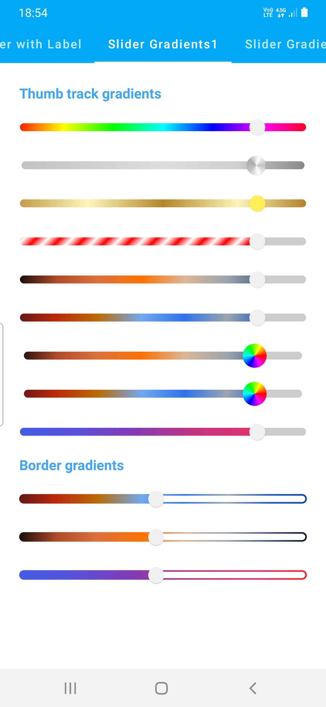
🚀🌈 😍 Colorful Sliders written with Jetpack Compose that enliven default sliders with track and thumb dimensions, and gradient colors, borders, labels on top or at the bottom move with thumb and ColorfulIconSlider that can display emoji or any Composable as thumb