
uteke
Long-term memory for AI agents (MCP). One Rust binary, offline, 98.2% recall@5 on LongMemEval-S. Works with Claude Code, Cursor, Codex. Self-host free or use Uteke Cloud.
- 291
- Rust
- Apache-2.0
- 5 d ago
CodeCora UI: shared design tokens, themes and Svelte 5 components (bits-ui) for CodeCora products
Repo codecoradev/codecora-ui, read from GitHub 2 d ago. codecoradev has not joined Take My Repo.
codecoradev/codecora-ui is a public repo on GitHub by codecoradev. CodeCora UI: shared design tokens, themes and Svelte 5 components (bits-ui) for CodeCora products. It declares the Apache-2.0 license on GitHub. It is written mainly in TypeScript, has 0 stars and last changed on 2026-11-15. Nobody has reviewed it on Take My Repo yet, which says nothing about its quality. Read from GitHub on 2026-11-20.
One design system, many themes. Design tokens, mixable themes and accessible Svelte 5 components on bits-ui, built for the CodeCora product fleet and open to any Svelte app.
Open the live playground: every component in every theme, with the theme, accent and density switchers. It is built from develop, so it shows the latest work.
data-theme, data-accent and
data-density work on any element, so a dark sidebar can sit next to light
content without a second stylesheet.contrast theme targets 7:1). Every component works with the keyboard
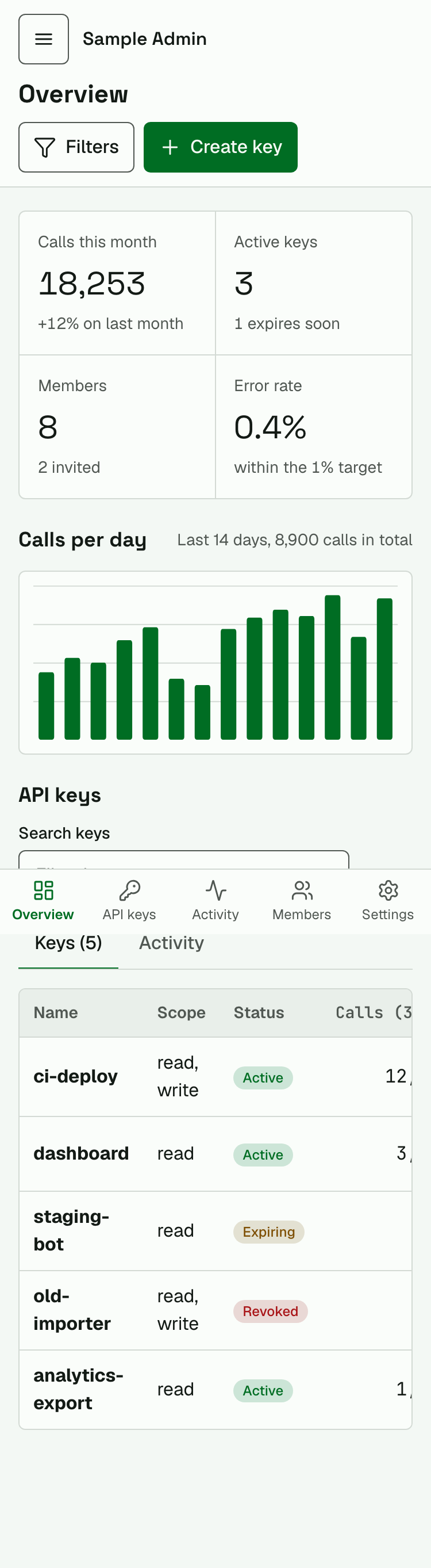
alone and at 375 px.Made by the team behind Uteke Cloud: long-term memory for Claude, ChatGPT and any MCP agent. Add one connector, sign in, and your agents remember across conversations and devices. The
uteketheme in this repository comes from it, and@codecora/memoryis its client. Try it free at uteke.app (open beta, no card).
0.7.0: @codecora/tokens 0.7.0 (the tagfold theme and a press token),
@codecora/ui 0.6.0 (press, radio, field, table and input motion) and
@codecora/memory 0.3.1, with @codecora/icons and @codecora/brand 0.1.0; a
shadcn-svelte registry with seven blocks ships with the playground (see
CHANGELOG.md). Not on npm yet: install from the GitHub Release
tarballs below. The API can still change before 1.0.
Each release attaches one tarball per package it ships. The same URL works with
bun, npm (npm install <url>) and pnpm (pnpm add <url>):
bun add https://github.com/codecoradev/codecora-ui/releases/download/v0.7.0/codecora-tokens-0.7.0.tgz
bun add https://github.com/codecoradev/codecora-ui/releases/download/v0.7.0/codecora-ui-0.6.0.tgz
bun add https://github.com/codecoradev/codecora-ui/releases/download/v0.7.0/codecora-memory-0.3.1.tgz
bun add https://github.com/codecoradev/codecora-ui/releases/download/v0.1.0/codecora-icons-0.1.0.tgz
bun add https://github.com/codecoradev/codecora-ui/releases/download/v0.1.0/codecora-brand-0.1.0.tgz
Install only what you use: @codecora/ui, @codecora/icons and
@codecora/brand need Tailwind 4 with @codecora/tokens/theme.css, plus the
source.css of each package you use. Publishing to npm under @codecora/* starts once the scope is
set up (#15); the import names stay the same.
/* app.css */
@import 'tailwindcss';
@import '@codecora/tokens/theme.css';
@import '@codecora/ui/source.css';
@import '@codecora/icons/source.css'; /* when you use Icon */
<script lang="ts">
  import { Button, Field, Input, Toaster, toast } from '@codecora/ui';
  import { Plus } from '@codecora/icons/lucide';

  let name = $state('');
</script>

<main data-theme="uteke" data-accent="teal">
  <Field label="Key name" description="Shown in the audit log.">
    {#snippet children(control)}
      <Input {...control} bind:value={name} placeholder="ci-deploy" />
    {/snippet}
  </Field>
  <Button variant="primary" icon={Plus} onclick={() => toast.success('Key created')}>
    Create key
  </Button>
</main>

<Toaster />
Components take any Svelte icon component as a prop, so you can bring Lucide, Phosphor or your own set.
| Package | What | Depends on |
|---|---|---|
@codecora/tokens |
Primitive, semantic and theme tokens; one Tailwind 4 stylesheet (theme.css) on the shadcn variable names, TS export |
nothing |
@codecora/ui |
42 Svelte 5 components on bits-ui, Tailwind 4 utilities on the theme roles | @codecora/tokens, bits-ui |
@codecora/icons |
Icon wrapper that follows each theme's size and stroke, a curated Lucide set and a Phosphor adapter |
@lucide/svelte, phosphor-svelte (optional peers) |
@codecora/brand |
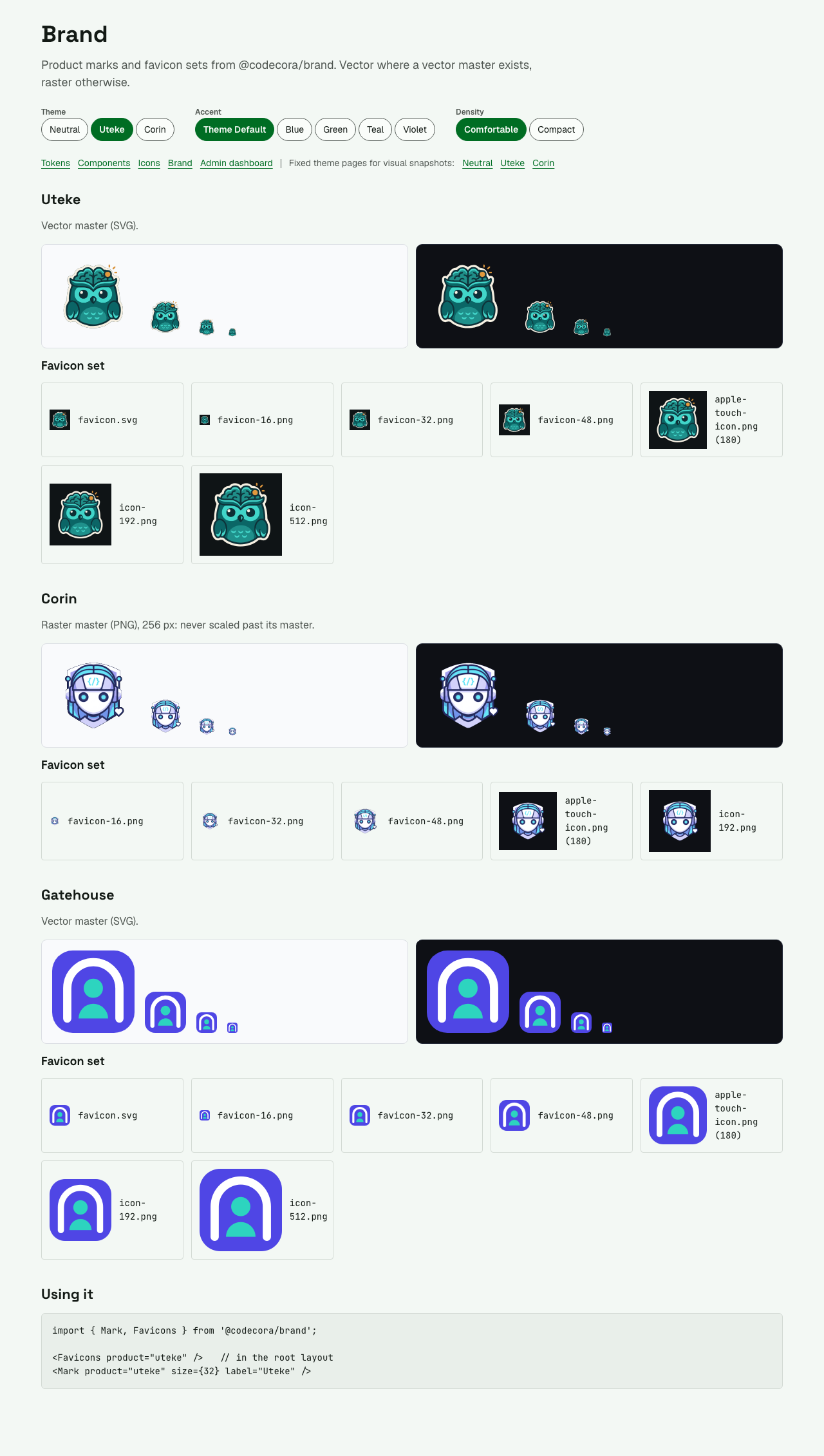
Product marks and favicon sets (Uteke, Corin, Gatehouse) as files and Svelte components | nothing |
@codecora/memory |
Uteke domain layer: typed MemoryClient over uteke-serve, Uteke Cloud (API and portal) and Tauri, with per-backend capabilities, and the memory browser components (MemoryList, MemoryDetail, MemoryEditor) |
@codecora/ui (peer) |
Dependencies point one way: memory -> ui -> tokens.
Apps on shadcn-svelte can also pull blocks (login, settings, dashboard shell,
console overview, resource detail, status panel, data table) and a theme bridge from the registry, served by the
playground build at /r/<item>.json:
npx shadcn-svelte@latest add <playground-host>/r/cc-login.json.
| Group | Components |
|---|---|
| Actions | Button, IconButton, Link, Kbd, Tooltip |
| Forms | Field, FieldGroup, Input, Textarea, Select, Combobox, Checkbox, Switch, RadioGroup, Slider, ToggleGroup |
| Overlays | Dialog, ConfirmDialog, Sheet, Popover, DropdownMenu, CommandPalette |
| Navigation | AppShell, Sidebar, Tabs, Breadcrumb, Pagination, Accordion |
| Data display | Table, DataTable, Card, Badge, Avatar, CodeBlock, Separator |
| Feedback | Alert, Toast (Toaster + toast), Progress, Spinner, Skeleton, EmptyState |
| Utilities | VisuallyHidden |
Each one is shown in every state, theme, accent and density in the playground.
| Theme | Character |
|---|---|
neutral |
The default: quiet greys, system-friendly |
neutral-dark |
Dark twin of neutral |
uteke |
Editorial light, from Uteke Cloud |
uteke-dark |
Dark twin of uteke |
corin |
Editor dark, from Corin |
corin-light |
Light twin of corin: warm paper, same teal |
gaira |
Volt on ink, from gaira; dark only |
tagfold |
Mint on slate, from tagfold; dark only |
sepia |
Serif reading theme |
contrast |
7:1 text, heavier focus rings and icons |
dimmed |
Low-glare dark: mid-grey surfaces, quieter accents |
slab |
Brutalist print: square corners, mono headings, hard shadows |
soft |
Consumer feel: round corners, rounded sans, thin icons |
neutral-cvd |
neutral with blue success and vermillion danger for colour-blind users |
Accents: blue, green, teal, violet, orange, indigo, cyan.
Densities: comfortable (44 px controls) and compact (32 px). Themes are
attributes, so they nest and mix:
<body data-theme="uteke">
  <aside data-theme="corin" data-accent="violet">dark sidebar</aside>
  <main data-density="compact">editorial light content</main>
</body>
Motion is part of the tokens too: four durations (instant to slow) and
four curves (out, in-out, exit, and a linear() spring). Under
prefers-reduced-motion every duration drops to 0 ms.
apps/playground is a SvelteKit catalogue of every component in every theme,
with theme, accent and density switchers: tokens, components, icons, brand, an
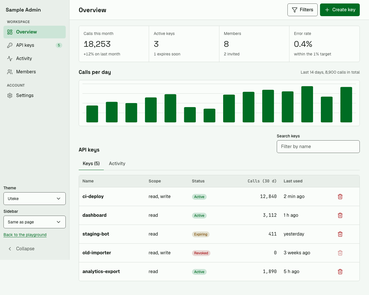
admin dashboard sample and app screens (sign in, settings, list and detail,
data table, first run).
bun install
bun run build:packages
bun run --cwd apps/playground dev
| Admin dashboard | On a phone (375 px) |
|---|---|
 |
 |
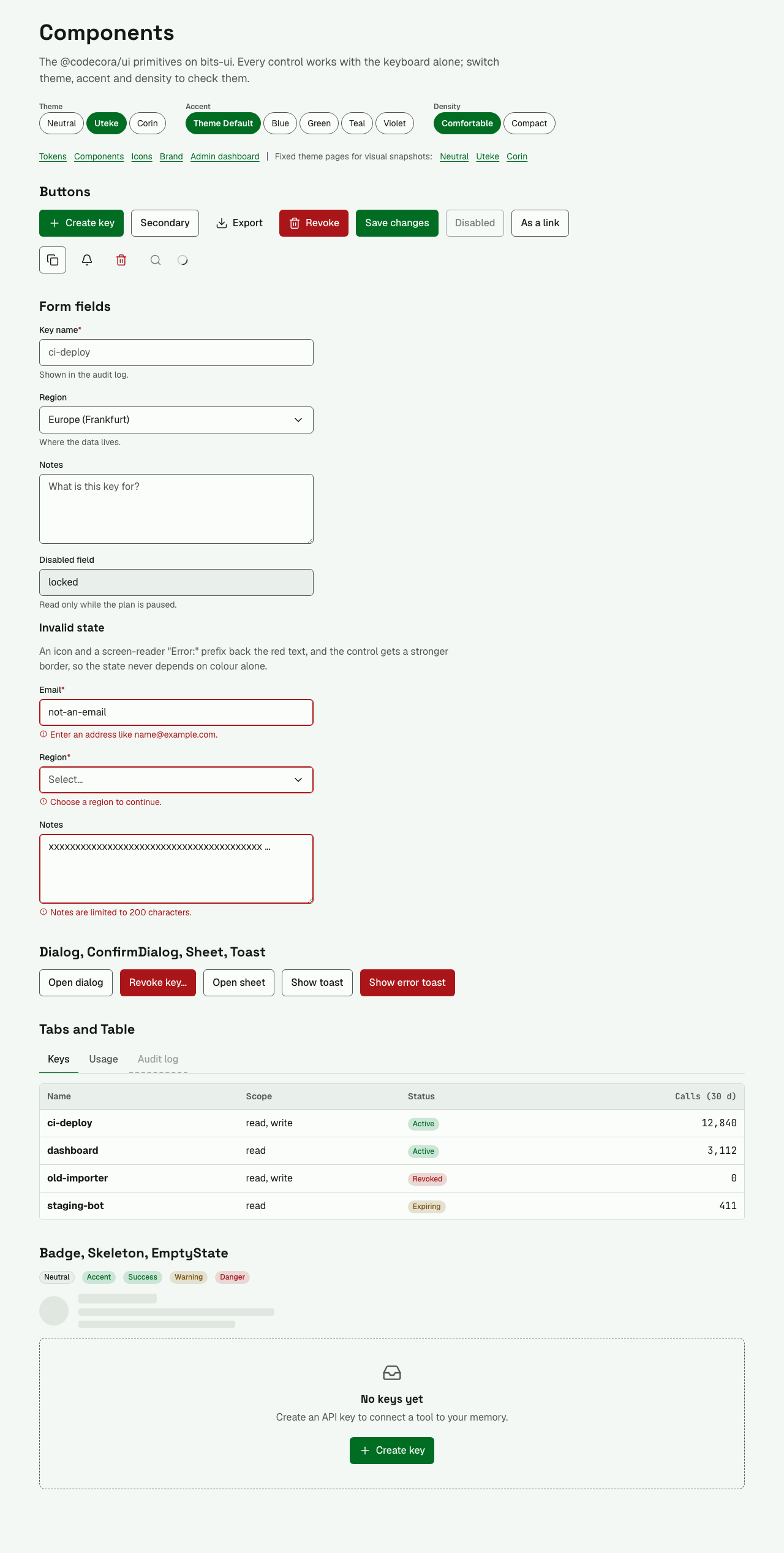
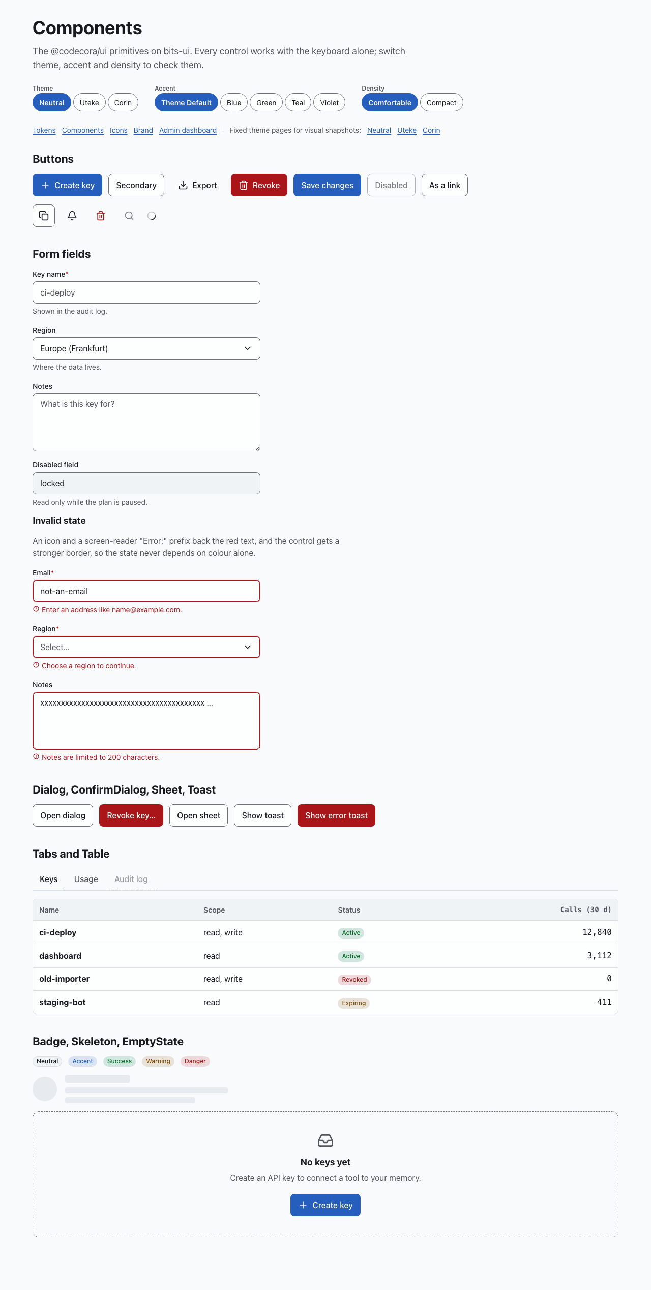
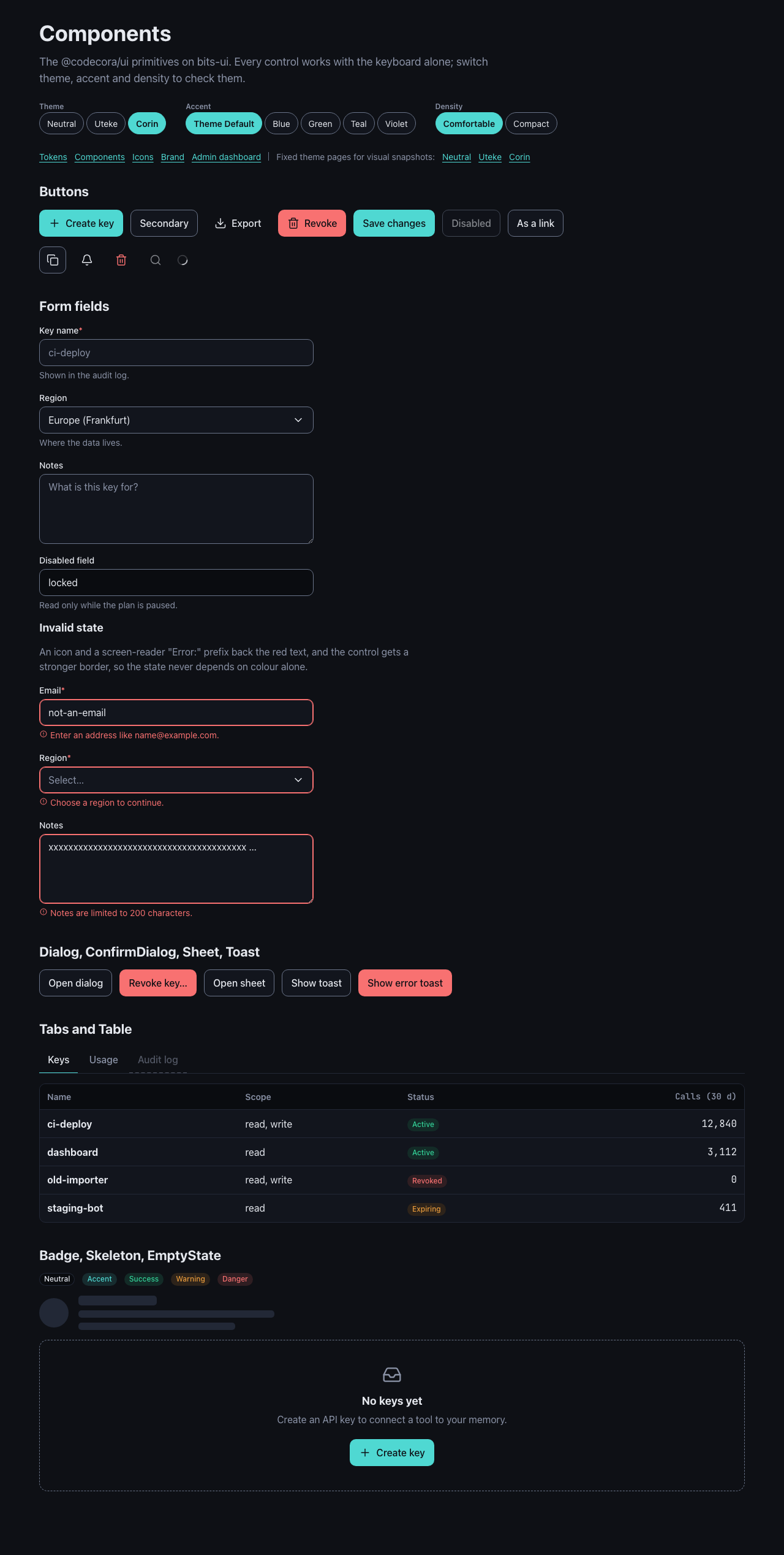
The Components page in three themes:
| Neutral | Uteke | Corin |
|---|---|---|
 |
|
 |
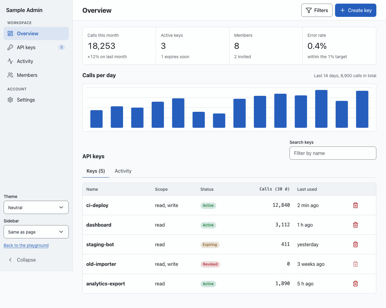
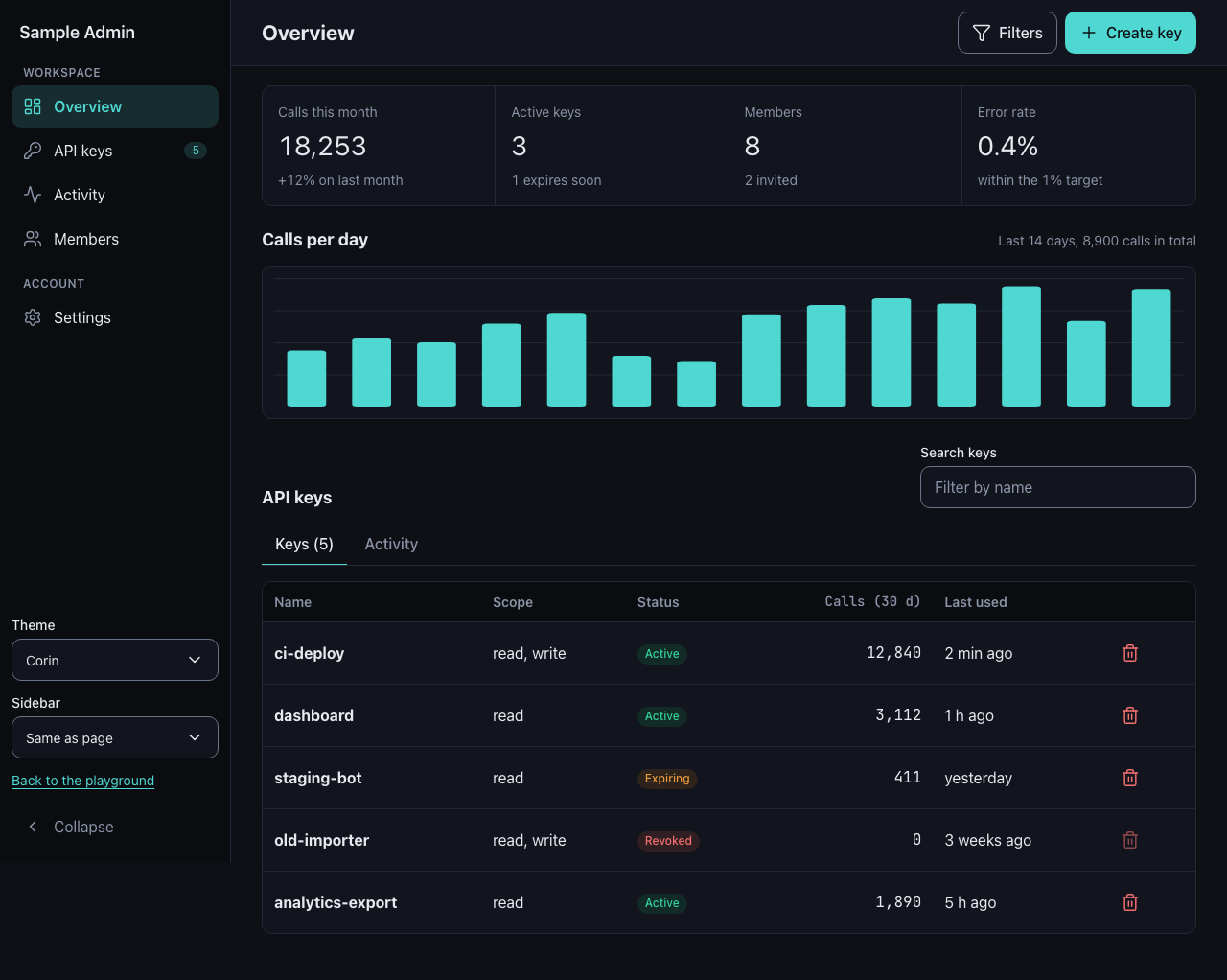
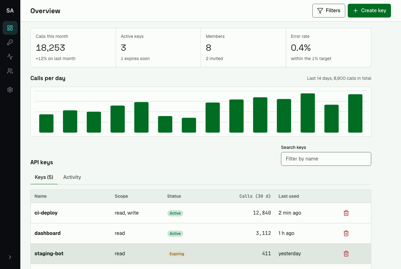
The admin dashboard sample in three themes:
| Neutral | Uteke | Corin |
|---|---|---|
 |
|
 |
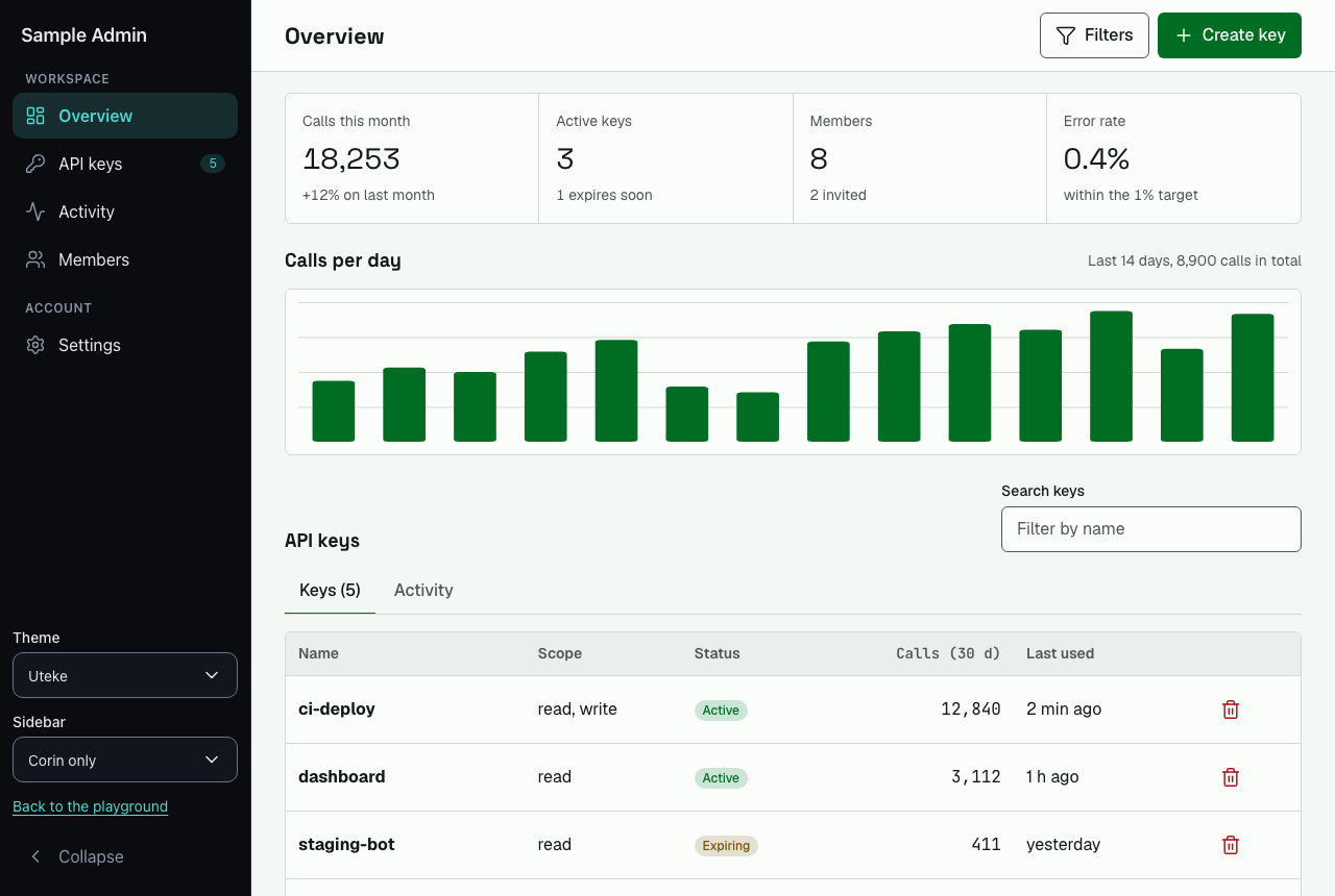
AppShell with a dark sidebar next to light content, and collapsed to icons:
| Dark sidebar | Collapsed |
|---|---|
 |
 |
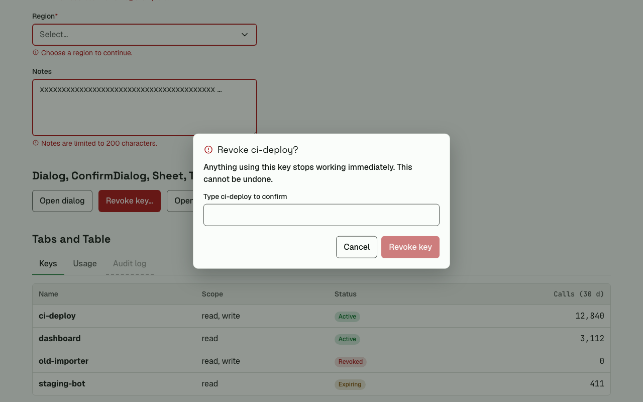
ConfirmDialog for an irreversible action:
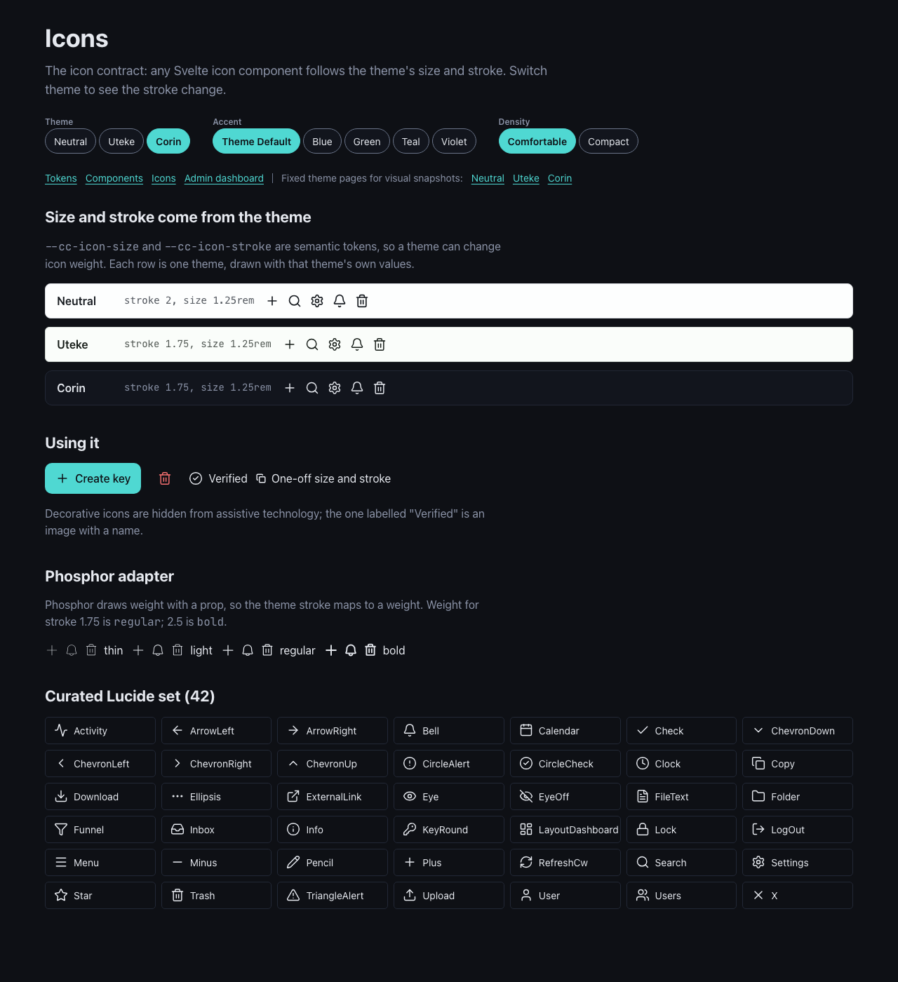
Icons follow each theme's size and stroke (neutral 2, uteke and corin 1.75):
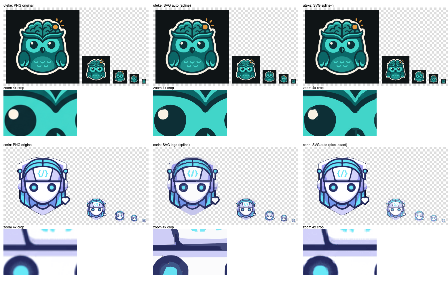
Brand marks and favicon sets, and the comparison that chose vector or PNG for each:
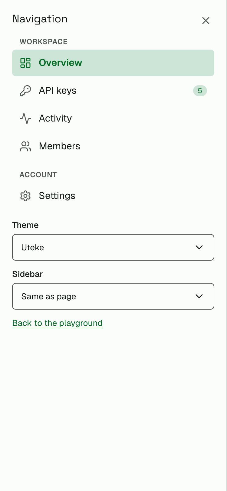
Navigation drawer at 375 px:
Bug fixes are welcome. Changes to direction (new packages, decisions D1–D13) start with an issue. See CONTRIBUTING.md and AGENTS.md for the workflow and the local gates.
codecoradev/codecora-ui is a public repo on GitHub by codecoradev. CodeCora UI: shared design tokens, themes and Svelte 5 components (bits-ui) for CodeCora products.
It declares the Apache-2.0 license on GitHub.
Its maker has not tagged a system, so it is unknown here. Its README says what it needs.
Open "Take it" on its page: Take My Repo writes an install plan for your machine and hands it to your AI agent (Claude Code, Codex or Cursor), which asks you before each step. Take My Repo has not tested it on any machine.
Its last change on GitHub was on 2026-11-15. Take My Repo does not judge from that whether it is maintained.
Nobody has reviewed it on Take My Repo yet, which says nothing about its quality.
Long-term memory for AI agents (MCP). One Rust binary, offline, 98.2% recall@5 on LongMemEval-S. Works with Claude Code, Cursor, Codex. Self-host free or use Uteke Cloud.
CLI-first AI code review — BYOK, diff/scan/branch, pre-commit hooks. 100% open source (MIT).
TrapFall — Lightweight self-hosted error capture engine. Sentry-compatible, Rust + SvelteKit 5.
CodeCora shared design tokens + VitePress adapter (Catppuccin Mocha). Single source of truth for web-landing and all product docs.
AI-powered code review GitHub Action — review PRs with cora-cli. BYOK, supports any OpenAI-compatible LLM.
