
FabulousFilter
Android library to animate Floating Action Button to Bottom Sheet Dialog and vice-versa
- 2.6k
- Java
- Apache-2.0
- 3 y ago
React component to displays data as a table or as cards, with animated transitions between the two layouts, on sorting, and on window resize.
Repo evoluteur/react-morph-table-cards, read from GitHub 6 h ago. evoluteur has not joined Take My Repo.
evoluteur/react-morph-table-cards is a public repo on GitHub by evoluteur. React component to displays data as a table or as cards, with animated transitions between the two layouts, on sorting, and on window resize. It declares the MIT license on GitHub. It is written mainly in TypeScript, has 2 stars and last changed on 2026-11-01. Nobody has reviewed it on Take My Repo yet, which says nothing about its quality. Read from GitHub on 2026-11-22.
A reusable React component that displays a list of items as a table or as cards, with animated transitions between the two layouts, on sorting, and on window resize.
Check out the Demo.
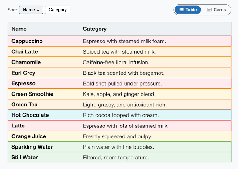
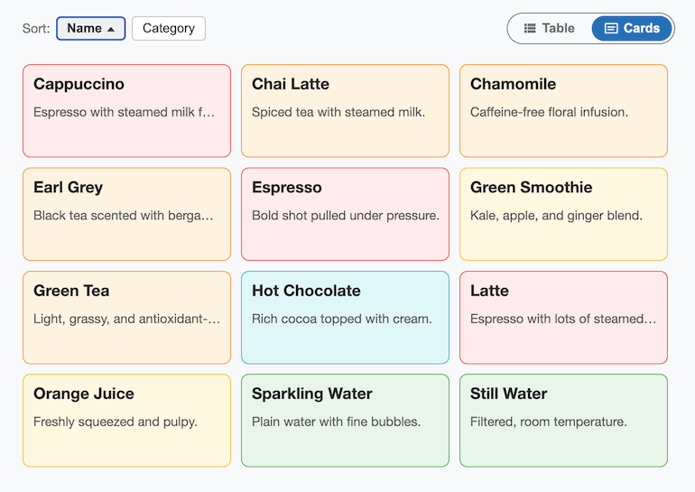
It's a React port of isomorphic-table-cards,
a vanilla-JS/CSS project that achieves the morphing effect with absolutely
positioned items and CSS transitions on transform which was a port of d3-table-cards.
npm install react-morph-table-cards
import { MorphTableCards } from "react-morph-table-cards";
import "react-morph-table-cards/style.css";

const data = [
  { id: 1, name: "Espresso", description: "Bold shot pulled under pressure.", category: "Coffee" },
  { id: 2, name: "Green Tea", description: "Light, grassy, and antioxidant-rich.", category: "Tea" },
  // ...
];

function App() {
  return (
    <MorphTableCards
      data={data}
      onItemClick={(item) => console.log("clicked", item)}
    />
  );
}
The component renders its own toolbar (Sort by Name/Category, a Table/Cards view toggle, and a light/dark/omg theme toggle) above the list, so it works as a drop-in, self-contained widget.
| Prop | Type | Required | Description |
|---|---|---|---|
data |
Array<{ id?, name, description, category }> |
yes | Items to display. id is optional; when omitted, name is used as the item's identity, so name should be unique. |
disabled |
boolean |
no | When true, dims the component and disables sorting, view toggling, and onItemClick. Defaults to false. |
className |
string |
no | Extra class name(s) applied to the root element. |
onItemClick |
(item, event) => void |
no | Called when an item (card or row) is clicked or activated via keyboard. |
These have sensible defaults and don't need to be set for typical use:
| Prop | Type | Default | Description |
|---|---|---|---|
defaultView |
"cards" | "table" |
"cards" |
Initial view. |
cardWidth |
number |
210 |
Card width in pixels (also used as the "Name" column width in table view). |
cardHeight |
number |
94 |
Card height in pixels. |
cardGap |
number |
10 |
Gap between cards, in pixels (cards view only). |
rowHeight |
number |
31 |
Row height in pixels (table view). |
theme |
"light" | "dark" | "omg" |
— | Controls the theme externally. Omit to let the component manage its own theme state (uncontrolled). |
defaultTheme |
"light" | "dark" | "omg" |
system preference | Initial theme when uncontrolled and nothing is in localStorage yet. |
onThemeChange |
(theme) => void |
— | Called whenever the theme changes (controlled or uncontrolled). |
themeStorageKey |
string |
— | When set, the chosen theme is persisted to localStorage under this key and restored on mount. Off by default so the component doesn't write to storage unasked. |
showThemeToggle |
boolean |
true |
Set to false to hide the built-in theme toggle (e.g. if the host page drives theme itself). |
The component ships with three themes — light, dark, and omg (the blue theme from evoluteur.github.io) — toggled with the same three-icon control (sun / moon / spiral) used on evoluteur-blog, rendered at the top right of the toolbar.
Theming is scoped to the component via a data-theme attribute on the root
.rmtc element — it never touches document.documentElement — so it's
safe to drop into a page that has its own theming system. Colors are driven
by CSS custom properties (--rmtc-bg, --rmtc-panel-bg, --rmtc-text,
--rmtc-text-secondary, --rmtc-border, --rmtc-primary,
--rmtc-toggle-bg), overridable per theme via .rmtc[data-theme="..."] if
you want to restyle or add a theme.
Items are color-coded by category, cycling through a 7-color default
palette (.rmtc-category-1 through .rmtc-category-7) defined in
style.css. Categories are colored in order of first appearance in data.
They render as light pastel chips, except in table view with the dark
theme, where rows use dark tints of the same hues (keeping the vivid
border color) so they don't glare on a dark page. Override these classes
to customize the palette.
Card and row sizes are set with the cardWidth, cardHeight, cardGap,
and rowHeight props. The component also exposes them as the CSS custom
properties --rmtc-card-width, --rmtc-card-height, and
--rmtc-row-height on the root .rmtc element (set inline, so change the
props rather than overriding these in CSS); you can read them in your own
styles.
Items are animated with the CSS translate and scale properties, so
the morphing effect needs a reasonably modern browser (Chrome/Edge 104+,
Safari 14.1+, Firefox 72+).
The bundle starts with a "use client" directive, so it can be imported
directly from Next.js App Router server components. It renders on the
server without errors, and the theme state falls back gracefully when
localStorage is unavailable (e.g. Safari private mode).
When server rendering, pass theme or defaultTheme: otherwise the server
renders the light theme while the browser may pick dark from the system
preference (or a stored theme), causing a hydration mismatch.
npm install
npm run dev      # runs the demo app in ./demo
npm run build    # builds the library to ./dist
react-morph-table-cards is released under the MIT license.
Encourage this project by becoming a sponsor.
You may want to also check out React-Morph-Charts, a similar project for animated transitions between bubble, bars, and pie charts.
(c) 2026 Olivier Giulieri.
evoluteur/react-morph-table-cards is a public repo on GitHub by evoluteur. React component to displays data as a table or as cards, with animated transitions between the two layouts, on sorting, and on window resize.
It declares the MIT license on GitHub.
Its maker has not tagged a system, so it is unknown here. Its README says what it needs.
Open "Take it" on its page: Take My Repo writes an install plan for your machine and hands it to your AI agent (Claude Code, Codex or Cursor), which asks you before each step. Take My Repo has not tested it on any machine.
Its last change on GitHub was on 2026-11-01. GitHub counts 0 open issues and pull requests. Take My Repo does not judge from that whether it is maintained.
Android library to animate Floating Action Button to Bottom Sheet Dialog and vice-versa
Nobody has reviewed it on Take My Repo yet, which says nothing about its quality.

This library represents a Bottom Navigation with an awesome morph effect on top of the selected item
Infinite cycle ViewPager with two-way orientation and interactive effect.
Flutter makes it easy and fast to build beautiful apps for mobile and beyond
f.k.a. Awesome ChatGPT Prompts. Share, discover, and collect prompts from the community. Free and open source — self-host for your organization with complete privacy.
jQuery UI widget for color picking with web colors, theme colors, and history (similar to the one in Microsoft Office 2010).
jQuery UI widget for structured queries like "Contacts where Firstname starts with A and Birthday before 1/1/2000 and State in (CA, NY, FL)"...
Model-driven Web UI for CRUD using REST or localStorage.
See who's behind your GitHub stars: an interactive network graph of your repos, followers, stargazers, and forks, right in your browser.
Model-driven UI for CRUD apps: List, Cards, Edit, Browse, Charts and Stats views generated from models stored in the database, plus a Designer to edit models in the app. React, TypeScript, Vite.
Model-driven REST API for CRUD: endpoints, charts, stats and OpenAPI docs generated from models stored as JSON in PostgreSQL. Edit models through the API, and tables follow. Node.js, Express, TypeScript.