AdaptiveStack
Adaptive SwiftUI layouts for iPad and Mac: sidebar, content and inspector columns that reflow by size class, with state restoration.
- 0
- MIT
- 7 wk ago
Repo halilozel1903/AdaptiveStack, read from GitHub 1 d ago. halilozel1903 has not joined Take My Repo.
In short
halilozel1903/AdaptiveStack is a public repo on GitHub by halilozel1903. Adaptive SwiftUI layouts for iPad and Mac: sidebar, content and inspector columns that reflow by size class, with state restoration. It declares the MIT license on GitHub. It is written mainly in Swift, has 0 stars and last changed on 2026-10-06. Nobody has reviewed it on Take My Repo yet, which says nothing about its quality. Read from GitHub on 2026-11-21.
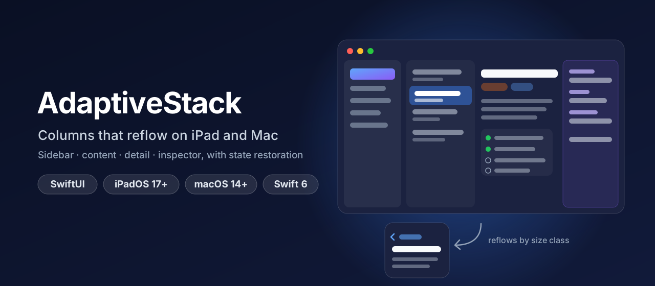
AdaptiveStack gives your SwiftUI app the four-column layout of Mail, Notes and Xcode on iPad and Mac: sidebar, content, detail and inspector that reflow with the available width. All four sit side by side on a wide screen. On a medium one the sidebar collapses and the inspector becomes a sheet (iPad) or takes the sidebar's room (Mac). In Slide Over or a narrow window everything turns into one navigation stack that keeps the same selection. Selection and column visibility are Codable, so every window comes back the way the user left it.
@SceneStorage("selection") private var selection = AdaptiveSelection<Project.ID, Task.ID>()
@SceneStorage("columns") private var columns = AdaptiveColumnState()

AdaptiveStack(selection: $selection, columns: $columns) {
    ProjectList(selection: $selection.sidebar)
} content: {
    TaskList(project: selection.sidebar, selection: $selection.item)
} detail: {
    TaskDetail(task: selection.item)
} inspector: {
    TaskInspector(task: selection.item)
}
Screenshots
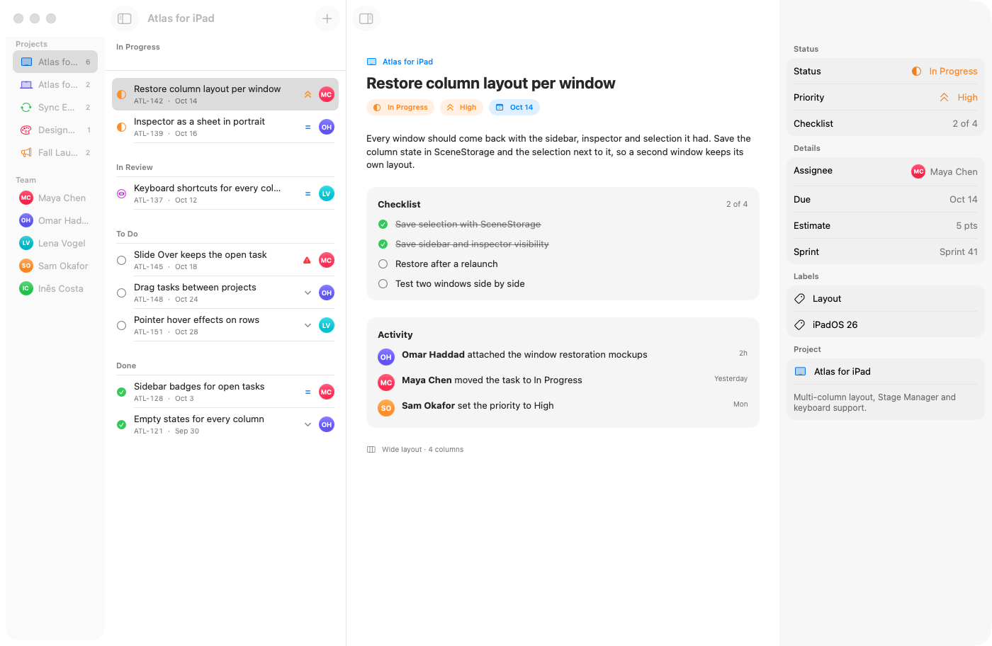
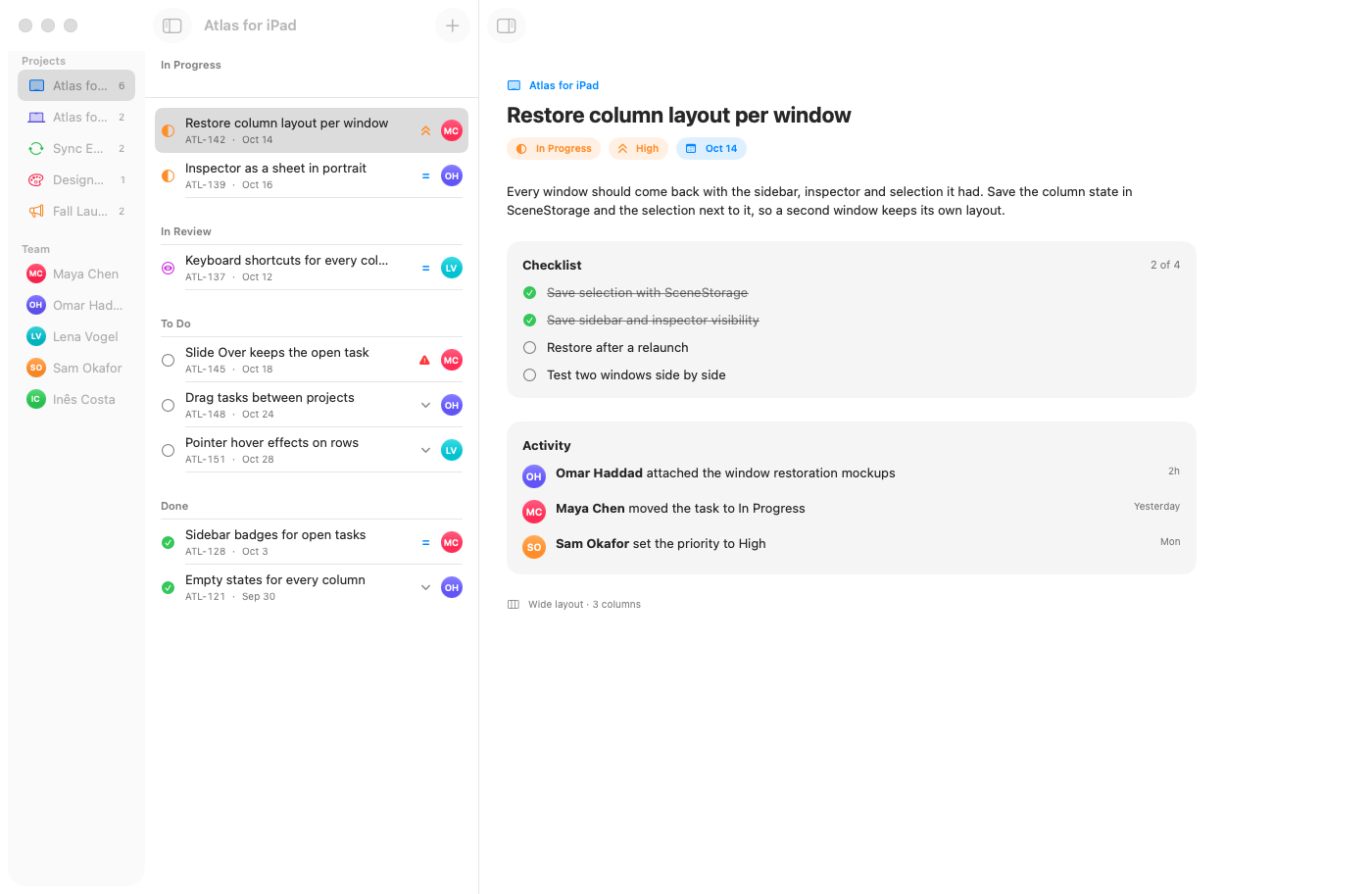
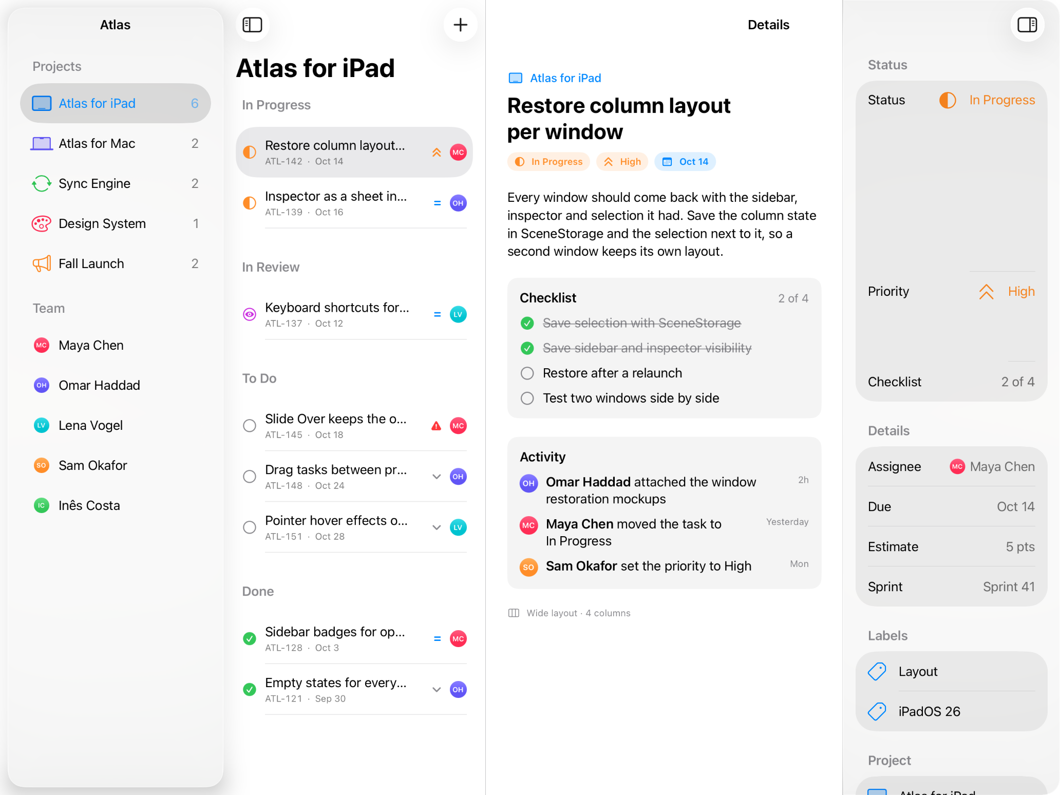
Captured by CI from Atlas, the example project tracker, on macOS 26 and on an iPad Pro 13-inch simulator with iPadOS 26.
| Mac: every column | Mac: inspector hidden |
|---|---|
 |
 |
| iPad in landscape: every column | iPad in portrait: collapsed |
|---|---|
 |
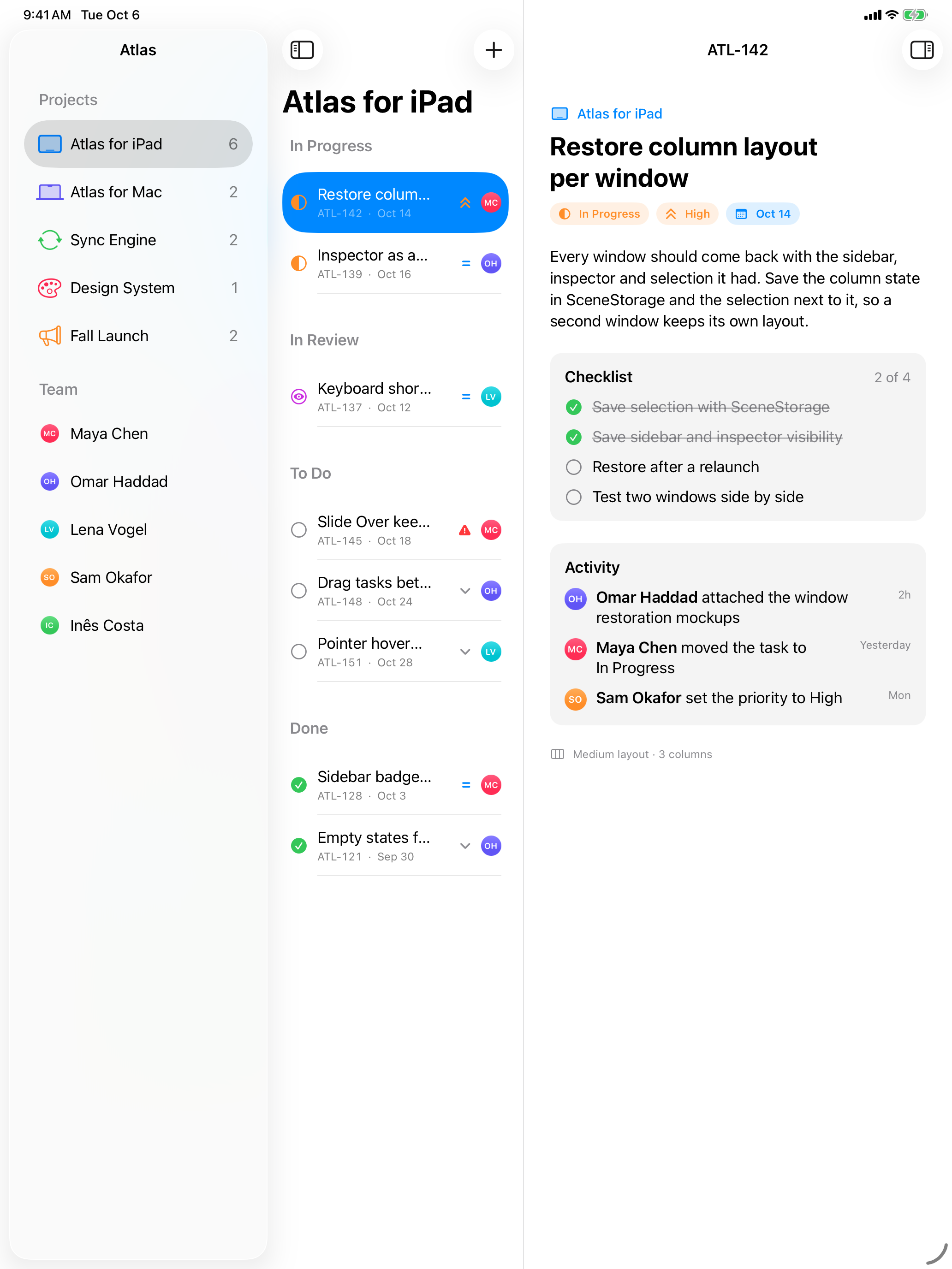 |
The iPad simulator is never rotated, since rotation from the command line is unreliable. It stays in its default portrait orientation. ipad-collapsed.png is that real portrait layout. For ipad-full.png the app lays itself out at the 13-inch landscape size (1376 × 1032 points, same size classes) scaled to the screen width, and the script crops the 4:3 band.
Features
- One view, four columns:
AdaptiveStack { sidebar } content: { } detail: { } inspector: { }builds aNavigationSplitViewwith SwiftUI's.inspector, column widths from the policy and the.balancedstyle. - A tested layout policy:
AdaptiveLayoutPolicyis a plain value with no SwiftUI in it. It takes the container width, the size classes, the platform and the user's choices, and returns which columns show, how the inspector is presented and what a collapsed stack shows. You can unit test every breakpoint. - Three modes:
- Wide (13-inch iPad in landscape, large Mac windows): sidebar, content, detail and inspector side by side.
- Medium (iPad in portrait or split screen, smaller windows): an automatic sidebar collapses when it does not fit, and the inspector becomes a sheet on iPad or hides the sidebar to stay a column on the Mac.
- Compact (Slide Over, narrow split screen, iPhone, narrow windows): a
NavigationStackwith the sidebar at its root, built from the same selection, so the user stays on the same task when the window shrinks or grows.
- Selection that survives everything:
AdaptiveSelectionholds the sidebar row and the item. Changing the project clears the task, and going back in the stack clears what was popped. It isCodableandRawRepresentable, so@SceneStorageand@AppStoragecan store it directly. - Column visibility persistence:
AdaptiveColumnStatestores the sidebar choice (automatic,all,doubleColumn,detailOnly) and whether the inspector is open. It works with@SceneStoragefor each window or@AppStoragefor the whole app, and decodes leniently so state saved by an older version still restores. - Toolbar buttons and keyboard shortcuts: a sidebar button (⌥⌘S) in the content column and an inspector button (⌥⌘I) in the detail column. The shortcuts work on the Mac and with a hardware keyboard on iPad.
.adaptiveInspector: the same column-or-sheet presentation for any view, with a Done button on the sheet.AdaptiveLayoutReaderand@Environment(\.adaptiveLayout): let any child read the current layout, for example to show a compact row in a narrow content column.- Swift 6 strict concurrency, no dependencies, tested with Swift Testing.
Installation
In Xcode choose File › Add Package Dependencies… and enter:
https://github.com/halilozel1903/AdaptiveStack
Or add it to Package.swift:
dependencies: [
    .package(url: "https://github.com/halilozel1903/AdaptiveStack", from: "1.0.0")
]
Usage
The stack
import AdaptiveStack
import SwiftUI

struct AtlasWindow: View {
    @SceneStorage("atlas.selection") private var selection = AdaptiveSelection<Project.ID, Task.ID>()
    @SceneStorage("atlas.columns") private var columns = AdaptiveColumnState(isInspectorPresented: true)

    var body: some View {
        AdaptiveStack(selection: $selection, columns: $columns) {
            List(projects, selection: $selection.sidebar) { project in
                Label(project.name, systemImage: project.symbol)
            }
            .navigationTitle("Atlas")
        } content: {
            List(tasks(in: selection.sidebar), selection: $selection.item) { task in
                TaskRow(task: task)
            }
        } detail: {
            TaskDetail(task: task(selection.item))
        } inspector: {
            TaskInspector(task: task(selection.item))
        }
    }
}
Use List(selection:) bound to $selection.sidebar and $selection.item. The split view highlights the selection, and in a compact layout selecting a row pushes the next column.
Leave out columns: to let the stack keep its own state, and leave out inspector: for a three-column layout without an inspector button.
The layout policy
let policy = AdaptiveLayoutPolicy()                        // the defaults below
let layout = policy.layout(
    in: AdaptiveLayoutContext(width: 1032, horizontalSizeClass: .regular, platform: .iOS),
    columns: AdaptiveColumnState(isInspectorPresented: true)
)
layout.mode               // .medium
layout.visibleColumns     // [.content, .detail]
layout.columnVisibility   // .doubleColumn
layout.inspectorStyle     // .sheet
| Column | Minimum | Ideal | Maximum |
|---|---|---|---|
| Sidebar | 200 | 260 | 340 |
| Content | 240 | 340 | 440 |
| Detail | 440 | 600 | – |
| Inspector | 240 | 300 | 380 |
| Width (points) | Mode | Columns | Inspector |
|---|---|---|---|
| 1376 (13" iPad landscape), 1400 (Mac) | Wide | Sidebar, content, detail, inspector | Column |
| 1180 (11" iPad landscape) | Medium | Sidebar, content, detail | Sheet on iPad; on the Mac the sidebar collapses and the inspector stays a column |
| 1032 (13" iPad portrait) | Medium | Content, detail | Sheet on iPad, column on the Mac |
| below 680, or a compact size class | Compact | One column in a navigation stack | Sheet |
The layout is wide from wideWidthThreshold (every ideal width plus the detail's minimum, 1340 points) and compact below compactWidthThreshold (content plus detail minimums, 680 points). A compact horizontal size class is always compact, and so is a compact vertical size class on iOS (an iPhone in landscape). Change the widths or the fallback to suit your content:
let policy = AdaptiveLayoutPolicy(
    sidebarWidth: AdaptiveColumnWidth(minimum: 180, ideal: 220, maximum: 300),
    detailWidth: AdaptiveColumnWidth(minimum: 360, ideal: 520, maximum: 1200),
    inspectorFallback: .sheet                               // .automatic, .sheet or .collapseSidebar
)

AdaptiveStack(selection: $selection, columns: $columns, policy: policy) { … }
Selection and the compact stack
var selection = AdaptiveSelection<String, Int>(sidebar: "atlas", item: 142)
selection.compactPath      // [.content, .detail]: the stack shows the task
selection.compactColumn    // .detail

selection.sidebar = "website"  // another project: the task is cleared
selection.compactPath      // [.content]

selection.applyCompactPath([])   // the user went back to the projects
selection.isEmpty          // true
Column visibility
columns.toggleSidebar(in: layout)   // hides a visible sidebar, shows a hidden one; ⌥⌘S does this
columns.toggleInspector()           // ⌥⌘I
columns.setSidebarVisible(false)
columns.resetSidebar()              // back to .automatic: the policy decides again

// Outside SwiftUI's property wrappers:
columns.save(to: .standard, forKey: "columns")
let restored = AdaptiveColumnState.restored(from: .standard, forKey: "columns")
AdaptiveColumnVisibility maps to and from NavigationSplitViewVisibility with splitViewVisibility and init(_:).
Reading the layout
struct TaskRow: View {
    @Environment(\.adaptiveLayout) private var layout

    var body: some View {
        if layout?.isCollapsed == true {
            CompactTaskRow(task: task)
        } else {
            WideTaskRow(task: task)
        }
    }
}

AdaptiveLayoutReader(columns: columns) { layout in
    Text("\(layout.mode.rawValue): \(layout.visibleColumns.count) columns")
}
Inspector on any view
TaskDetail(task: task)
    .adaptiveInspector(isPresented: $showsInspector) {
        TaskInspector(task: task)
    }

// Or with a fixed style:
    .adaptiveInspector(isPresented: $showsInspector, style: .sheet) { … }
How it works
| Wide | Medium | Compact | |
|---|---|---|---|
| Container | NavigationSplitView |
NavigationSplitView |
NavigationStack(path:) |
| Sidebar | Column | Column when it fits or the user asked for it | Root of the stack |
| Inspector | .inspector column |
iPad: .sheet. Mac: .inspector column, sidebar collapsed |
.sheet |
| Selection | List(selection:) |
List(selection:) |
Path derived from the selection |
AdaptiveStack measures its width with AdaptiveLayoutReader, reads the size classes on iPad and asks the policy for a layout. The split view's visibility binding is the policy's resolved value. When the user drags a column away, that change becomes an explicit choice in AdaptiveColumnState, and an automatic sidebar stays automatic until then. The inspector modifier applies both .inspector and .sheet, each gated by the resolved style, so switching between them never changes the view's identity.
Example app
The Example folder contains Atlas, a made-up project tracker for iPad and Mac with projects, tasks grouped by status, a task detail with a checklist and activity, and an inspector with the task's metadata. Rotate the iPad, use split screen or Slide Over, or resize the Mac window to watch the columns reflow. Selection and columns are restored per window with @SceneStorage. The example uses XcodeGen, so no project file has to live in the repo:
brew install xcodegen
cd Example && xcodegen generate
open AdaptiveStackDemo.xcodeproj    # schemes AdaptiveStackDemoPad and AdaptiveStackDemoMac
Launch with -screenshot full, -screenshot collapsed (iPad) or -screenshot inspector-hidden (Mac) to see the fixed scenes CI captures.
Requirements
- Xcode 26 or later (Swift 6.2 toolchain)
- iPadOS 17+ (also runs on iOS 17+ as a navigation stack), macOS 14+
Contributing
Issues and pull requests are welcome. Please run swift test before opening a PR.
License
AdaptiveStack is available under the MIT license. See LICENSE.
Questions
What is AdaptiveStack?
halilozel1903/AdaptiveStack is a public repo on GitHub by halilozel1903. Adaptive SwiftUI layouts for iPad and Mac: sidebar, content and inspector columns that reflow by size class, with state restoration.
Is AdaptiveStack open source?
It declares the MIT license on GitHub.
Does AdaptiveStack run on macOS, Windows or Linux?
Its maker tagged it for macOS. That is declared by the maker; Take My Repo has not tested it.
How do I install AdaptiveStack?
Open "Take it" on its page: Take My Repo writes an install plan for your machine and hands it to your AI agent (Claude Code, Codex or Cursor), which asks you before each step. Take My Repo has not tested it on any machine.
Is AdaptiveStack still maintained?
Its last change on GitHub was on 2026-10-06. Take My Repo does not judge from that whether it is maintained.
What do people who ran AdaptiveStack say?
Nobody has reviewed it on Take My Repo yet, which says nothing about its quality.