
Study-CSS-Grid
A handy study of CSS grid functionality including: grid examples, styling, media query examples, common patterns, templates, useful snippets, and other interesting research notes.
- 1
- 7 y ago
Repo john-azzaro/Study-CSS-Grid, read from GitHub 1 d ago. john-azzaro has not joined Take My Repo.
In short
john-azzaro/Study-CSS-Grid is a public repo on GitHub by john-azzaro. A handy study of CSS grid functionality including: grid examples, styling, media query examples, common patterns, templates, useful snippets, and other interesting research notes. It declares no license on GitHub. Public does not mean open source: without a license, nobody is granted the right to reuse it. It is written mainly in CSS, has 1 stars and last changed on 2020-02-13. Nobody has reviewed it on Take My Repo yet, which says nothing about its quality. Read from GitHub on 2026-11-21.
CSS Grid Study
What is the CSS Grid Study?
CSS Grid study is a practical examination of CSS Grid, a two dimensional layout system which allows you to control positioning, sizing, and spacing of content. Anything declared in the grid will adapt to the columns and rows defined.
Here are a few questions from the study to consider:
- What are the basics of CSS Grid.
- What are important declarations to know when using grid?
- What are some basic examples of CSS Grid
- Screenshots
What are the basics of CSS Grid.
The grid CONTAINER (".grid") contains all the child ITEMS within it. The grid template COLUMNS and gird template ROWS provide us with numbered grid LINES that we use for positioning the items.
Grid CONTAINERS establish the grid
- The grid container establishes how the grid will be formatted.
- It also manages how all the child elements are spaced, sized, and aligned.
- Additionally, for uniformity, use the ".grid" class.
Grid ITEMS are the children of the grid parent.
Everything inside the grid container are the grid container's children
Example:
 <main class="grid">                             \\ The main is the parent container
     <section class="childone">...</section>     \\ The three sections are the child items
     <section class="childtwo">...</section>
     <section class="childthree">...</section>
 </main>
Grid LINES dissect the container space.
- The grid is formed by intersecting sets of hrozontal and veritcal lines call grid lines.
- Grid lines divide the contianer space into columns and rows, or areas in which items are aligned and placed.
- Horizontal grid lines position rows.
- Veritical grid lines position columns.
- Grid column lines start from left to right from 1 to X.
- Grid row lines starts from top to bottom from 1 to X.
- A grid line is not a complete column or row, they only outline the row or the column.
- For example, column 1 would have 2 grid lines on the left and right side.
- As another example, a three column layout would have 4 grid lines.
Example:
```
    1           2           3           4
 1   ___________________________________         \\ First horizontal row grid line.
    | [column1] | [column2] | [column3] |        \\ 3 columns (tracks), 4 grid lines.
 2   ___________________________________         \\ Second horizontal row grid line.
    | [column1] | [column1] | [column1] |
 3   ___________________________________         \\ Third horizontal row grid line.
```
What are important declarations to know when using grid?
minmax lets you set the grid track's minimum and maxium size.
- minimum size will let you make sure the content doesnt become to small or narrow where you cant see it.
- maximum size will let you make sure the content doesnt become to wide or tall.
- using minmax will help you build layouts that adapt to a wide range of screen sizes.
- to use minmax, use it in the
grid-template-columnsdeclaration.
grid-template-columns: minmax() 1fr 1fr; // 3 tracks, first is a minmax, second and third are set to 1fr.
- minmax accepts two values, a minimum (first) and a maximum (last).
- the value for min needs to be smaller than the value for maximum (otherwise browser will ignore the max value).
- In the example below, there are three tracks. the first track has a minmax function where the column will collapse no smaller than 300px. The max is 1fr, maeing it will exand as needed.
grid-template-columns: minmax(300px, 1fr) 1fr 1fr; ;
Repeat is a shortcut for repeating patterns of tracks.
- Repeat is a shortcut of tracks so you dont have to write the sam values over again.
- Can be used in the
grid-template-columnsandgrid-template-rows. - So when do you use the repeat function.
- Suppose you have a grid template column declaration with 6 columns:
grid-template-columns: 1fr 1fr 1fr 1fr 1fr 1fr;- create a repeat function and in the call signature, pass in the following values:
- Repetition value: The number of tracks you want it to repeat. In this case, we want 6.
- Repeat value: The size you want to repeat. In this case, its 1fr.
- So this function repeats the 1fr six times in the layout.
grid-template-columns: repeat(6, 1fr)- If you have some columns with different values, but a part that can use repeat, you can do this:
grid-template-columns: 3fr repeat(3, 1fr);...
CSS Grid FAQ:
How do I center text (horizontally and vertically)?
To center text horzontally and veritcally, you need to use
display: flex.justify-contentandalign-itemswill put text dead-center.
.main {
  grid-area: main;
  display: flex;
  justify-content: center;
  align-items: center;
  font-size: 8.0vw;
}
What are some basic examples of CSS Grid
Example of CSS Grid HTML
    <main class="grid">
        <section class="item1">1</section>
        <section class="item2">2</section>
        <section class="item3">3</section>
        <section class="item4">4</section>
        <section class="item5">5</section>
    </main>
Example of CSS Grid
                                                                                                    /* Notes */
* {
    box-sizing: border-box;                                                                         /* Make sure sizing repsects the dimensions explicitly stated */
    margin: 0;                                                                                      /* Reset Rule: sets all elements to 0 margin. Helpful for making consistent designs.*/
    padding: 0;                                                                                     /* Reset Rule: sets all elements to 0 padding. Helpful for making consistent designs.*/
}


.grid {
    display: grid;                                                                                   /* Display property type */
    grid-template-columns: minmax(150px, 1fr) minmax(50%, 1fr) minmax(150px, 1fr);                   /* Column widths with minmax setting smallest and largest scales */
    grid-template-rows: minmax(50px, 100px) minmax(300px, 1fr) minmax(50px, 100px);                  /* Row height with minmax setting shortest to tallest scales */
    height: 100vh;                                                                                   /* Height expressed in full viewport height (i.e. 100vh) */
    grid-column-gap: 0;                                                                              /* Veritcal spacing between columns */
    grid-row-gap: 0;                                                                                 /* Horizontal spacing between rows */
    grid-template-areas:                                                                             /* Specifies the areas wihin the grid layout*/
    "item1 item1 item1"
    "item2 item3 item4"
    "item5 item5 item5"
    ;
}

        .item1 {                                                                                      /* grid item */
            grid-area: item1;                                                                         /* grid area identification for grid-template-areas */
            background-color: lightblue;
        }

        .item2 {
            grid-area: item2;
            background-color: lightpink;
        }

        .item3 {
            grid-area: item3;
            background-color: lightcyan;
        }

        .item4 {
            grid-area: item4;
            background-color: lightslategrey;
        }

        .item5 {
            grid-area: item5;
            background-color: lightyellow;
        }
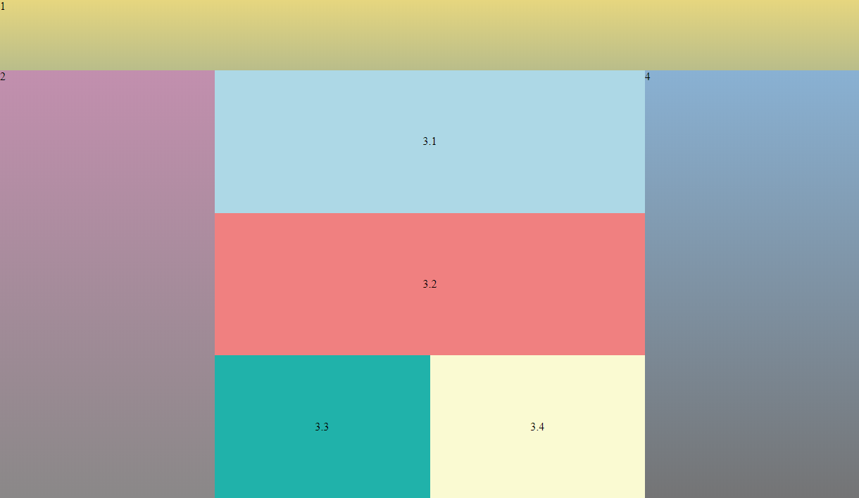
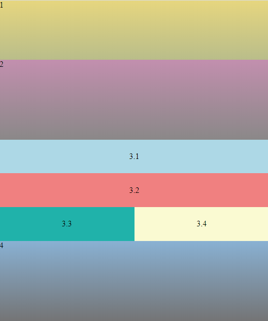
Example of NESTED Grid HTML
    <main class="grid">
        <section class="item1">1</section>
        <section class="item2">2</section>
        <section class="item3">
            <div class="nestedgrid">
                <div class="nested1">3.1</div>
                <div class="nested2">3.2</div>
                <div class="nested3">3.3</div>
                <div class="nested4">3.4</div>
            </div>
        </section>
        <section class="item4">4</section>
        <section class="item5">5</section>
    </main>
Example of NESTED Grid CSS
.nestedgrid {
    display: grid;
    grid-template-columns: 1fr 1fr;
    height: 100%;
    margin: 4px;
    grid-column-gap: 4px;
    grid-row-gap: 4px;
    grid-template-areas:
    "nested1 nested1"
    "nested2 nested2"
    "nested3 nested4"
    ;
}

        .nested1 {
            grid-area: nested1;
            background-color: blue;
            display: flex;
            align-items: center;
            justify-content: center;
        }

        .nested2 {
            grid-area: nested2;
            background-color: red;
            display: flex;
            align-items: center;
            justify-content: center;
        }

        .nested3 {
            grid-area: nested3;
            background-color: green;
            display: flex;
            align-items: center;
            justify-content: center;
        }

        .nested4 {
            grid-area: nested4;
            background-color: purple;
            display: flex;
            align-items: center;
            justify-content: center;
        }
Screenshots
Questions
What is Study-CSS-Grid?
john-azzaro/Study-CSS-Grid is a public repo on GitHub by john-azzaro. A handy study of CSS grid functionality including: grid examples, styling, media query examples, common patterns, templates, useful snippets, and other interesting research notes.
Is Study-CSS-Grid open source?
It declares no license on GitHub. Public does not mean open source: without a license, nobody is granted the right to reuse it.
Does Study-CSS-Grid run on macOS, Windows or Linux?
Its maker has not tagged a system, so it is unknown here. Its README says what it needs.
How do I install Study-CSS-Grid?
Open "Take it" on its page: Take My Repo writes an install plan for your machine and hands it to your AI agent (Claude Code, Codex or Cursor), which asks you before each step. Take My Repo has not tested it on any machine.
Is Study-CSS-Grid still maintained?
Its last change on GitHub was on 2020-02-13. Take My Repo does not judge from that whether it is maintained.


