signals
Signals for Tailwind CSS simplifies styling based on ancestor state via style queries. Its declarative API for signaling states eliminates complex selectors, resulting in cleaner, more maintainable code.
- 793
- TypeScript
- MIT
- 3 y ago
The maintainer has not written a description at the source.
Repo toolwind/corner-shape, read from GitHub 4 h ago. toolwind has not joined Take My Repo.
toolwind/corner-shape is a public repo on GitHub by toolwind. It declares the MIT license on GitHub. It is written mainly in TypeScript, has 226 stars and last changed on 2025-11-20. Nobody has reviewed it on Take My Repo yet, which says nothing about its quality. Read from GitHub on 2026-11-21.
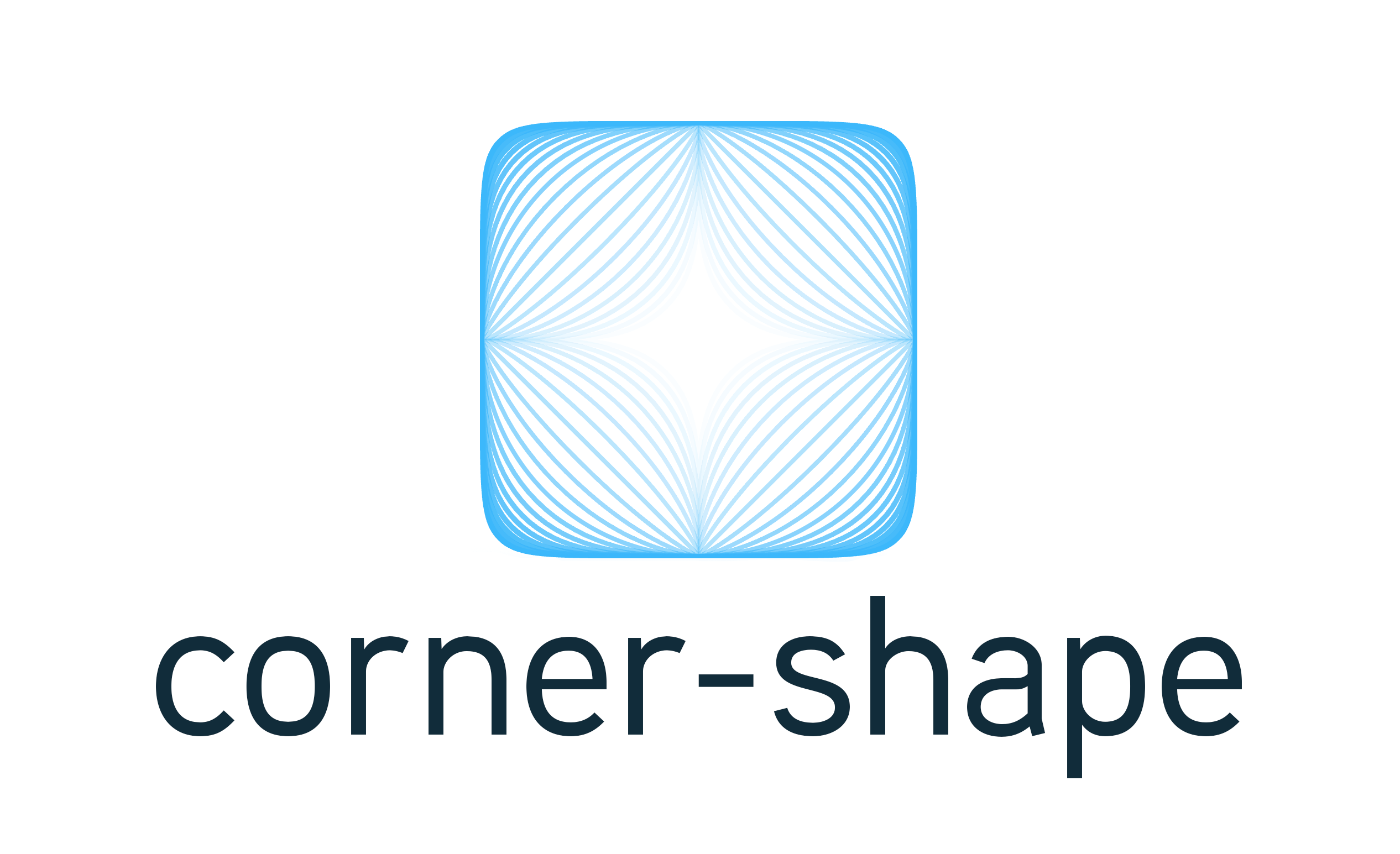
Tailwind CSS plugin that adds first-class utilities for the CSS corner-shape property and its per-corner longhands (e.g. corner-top-left-shape). It supports static keywords like round, scoop, bevel, notch, square, squircle, as well as the functional value superellipse(<value>).
You can install the plugin via npm:
npm install @toolwind/corner-shape # or pnpm, yarn, bun
Tailwind CSS ≥ v4.0.0/* globals.css */ @import "tailwindcss"; @plugin "@toolwind/corner-shape"; |
||
Tailwind CSS < v4.0.0
|
This plugin leverages the new CSS corner-shape property, which allows you to control the shape of element corners using both standard keywords as well as functional values.
Because this property is not yet supported in all browsers, consider it forward-looking, though it is safe to use as it degrades gracefully. The utilities generated by this plugin map directly to the corner-shape property and its per-corner longhands.
For example:
<div class="corner-squircle">…</div>
.corner-squircle {
  corner-shape: squircle;
}
View this example on Tailwind Play
corner-{shape}corner-t-{shape} → top-left and top-rightcorner-r-{shape} → top-right and bottom-rightcorner-b-{shape} → bottom-right and bottom-leftcorner-l-{shape} → top-left and bottom-leftcorner-tl-{shape}, corner-tr-{shape}, corner-br-{shape}, corner-bl-{shape}corner-s-{shape} → start-start and end-startcorner-e-{shape} → start-end and end-endcorner-ss-{shape}, corner-se-{shape}, corner-ee-{shape}, corner-es-{shape}Supported static shapes: round, scoop, bevel, notch, square, squircle
<div class="
  corner-squircle
  md:corner-t-bevel
  lg:corner-tr-notch
">
</div>
superellipseUse Tailwind’s modifier syntax (/) to pass a superellipse(<value>) parameter:
.corner-superellipse/50.corner-t-superellipse/32.corner-tr-superellipse/e.corner-s-superellipse/-piAccepted values are:
2, 0.5, -1)e, pi, infinity (optionally negative: -e, -pi, -infinity)Examples:
<div class="corner-superellipse/1.5"></div>
<div class="corner-br-superellipse/pi"></div>
<div class="corner-e-superellipse/-infinity"></div>
Notes:
superellipse(<value>). Do not include units.s, e, ss, se, ee, es) adapt with writing direction.| Keyword | Description | Equivalent |
|---|---|---|
| bevel | Defines a straight, diagonal corner, which is neither convex nor concave. | superellipse(0) |
| notch | Defines a 90-degree concave square corner. | superellipse(-infinity) |
| round | Defines a convex ordinary ellipse; the standard rounded corner created by border-radius without corner-shape. This is the default (initial) value. |
superellipse(1) |
| scoop | Defines a concave ordinary ellipse. | superellipse(-1) |
| square | Defines a 90-degree convex square corner; the default shape when no border-radius (or border-radius: 0) is applied. |
superellipse(infinity) |
| squircle | Defines a “squircle”, a convex curve in between round and square. | superellipse(2) |
corner-{shape}corner-superellipse/{value}corner-{t|r|b|l}-{shape}corner-{t|r|b|l}-superellipse/{value}corner-{tl|tr|br|bl}-{shape}corner-{tl|tr|br|bl}-superellipse/{value}corner-s-{shape}, corner-e-{shape}corner-{s|e}-superellipse/{value}corner-{ss|se|ee|es}-{shape}corner-{ss|se|ee|es}-superellipse/{value}Where {shape} is one of round, scoop, bevel, notch, square, squircle.
All standard Tailwind variants work:
<button class="hover:corner-s-squircle focus:corner-br-bevel"></button>
This plugin emits the corner-shape and corner-*-shape properties. Support for these properties varies by browser and may change over time. Consider providing design fallbacks (e.g. border-radius) where necessary.
I hope you find @toolwind/corner-shape a valuable addition to your projects. If you have any issues or suggestions, don't hesitate to open an issue or pull request.
If you liked this, you might also like my other Tailwind CSS plugins:
shadow-border utilities too)toolwind/corner-shape is a public repo on GitHub by toolwind. Its maker has not written a description.
It declares the MIT license on GitHub.
Its maker has not tagged a system, so it is unknown here. Its README says what it needs.
Open "Take it" on its page: Take My Repo writes an install plan for your machine and hands it to your AI agent (Claude Code, Codex or Cursor), which asks you before each step. Take My Repo has not tested it on any machine.
Its last change on GitHub was on 2025-11-20. Take My Repo does not judge from that whether it is maintained.
Nobody has reviewed it on Take My Repo yet, which says nothing about its quality.
Signals for Tailwind CSS simplifies styling based on ancestor state via style queries. Its declarative API for signaling states eliminates complex selectors, resulting in cleaner, more maintainable code.
Anchors for Tailwind CSS provides a simple API for working with CSS anchor positioning, enabling flexible, declarative positioning relative to custom anchors.
Mixins for Tailwind CSS provides a declarative API for creating reusable groups of utilities, reducing code duplication and improving maintainability while emphasizing a utility-first approach.
Members for Tailwind CSS simplifies styling an ancestor element based on the state of its descendants.
Interpolate between defined colors in Tailwind config for additional color stops (e.g. red-425). Built with chroma.js.