bootstrap-layout




bootstrap-gutters
Gutters are the padding between your columns, used to responsively space and align content in the Bootstrap grid system.
- 0
- MIT
- 2 y ago
bootstrap-float
Toggle floats on any element, at any breakpoint, using responsive float utilities.
- 0
- MIT
- 2 y ago

bootstrap-flexbox
Quickly manage the layout, alignment, and sizing of grid columns, navigation, components, and more with a full suite of responsive flexbox utilities. For more complex implementations, custom CSS may be necessary.
- 0
- MIT
- 2 y ago
bootstrap-display
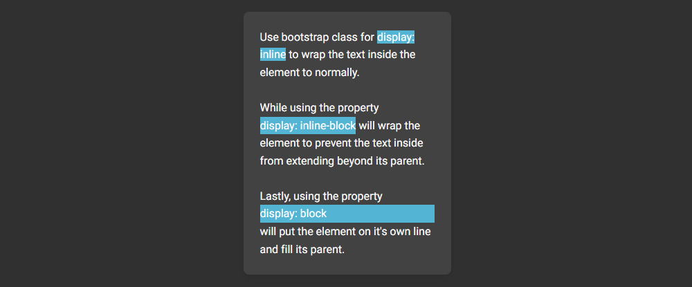
Quickly and responsively toggle the display value of components and more with our display utilities. Includes support for some of the more common values, as well as some extras for controlling display when printing.
- 0
- MIT
- 2 y ago

bootstrap-css-grid
Learn how to enable, use, and customize our alternate CSS Grid based layout system with examples and code snippets.
- 0
- MIT
- 2 y ago
bootstrap-containers
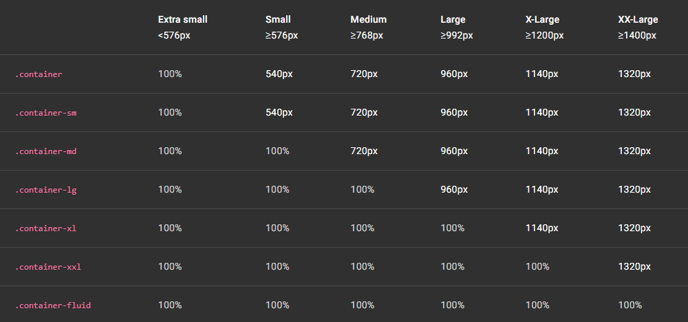
Containers are a fundamental building block of Bootstrap that contain, pad, and align your content within a given device or viewport.
- 0
- MIT
- 2 y ago
bootstrap-breakpoints
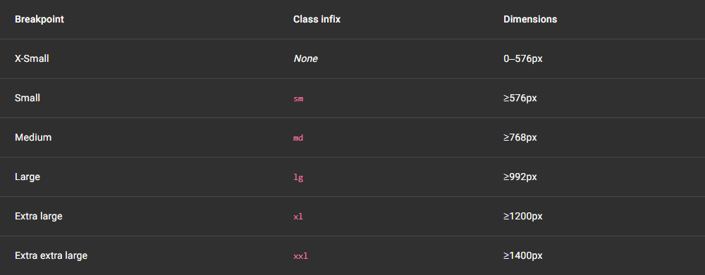
Breakpoints are the triggers in Bootstrap for how your layout responsive changes across device or viewport sizes.
- 0
- MIT
- 2 y ago
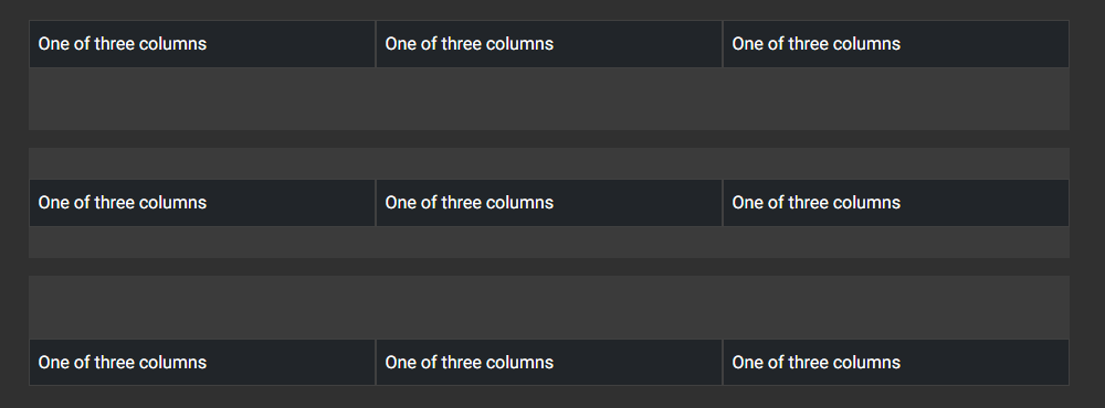
bootstrap-columns
Learn how to modify columns with multiple alignment, ordering, and and offsetting with the flexbox grid system. Also, see how to use column classes to manage widths of non-grid elements.
- 0
- MIT
- 2 y ago