bootstrap
The most popular HTML, CSS, and JavaScript framework for developing responsive, mobile first projects on the web.
- 175k
- JavaScript
- MIT
- 1 d ago
CSS Basics ( CSS-3 )
Repo learning-zone/css-basics, read from GitHub 2 d ago. learning-zone has not joined Take My Repo.
learning-zone/css-basics is a public repo on GitHub by learning-zone. CSS Basics ( CSS-3 ). It declares no license on GitHub. Public does not mean open source: without a license, nobody is granted the right to reuse it. It is written mainly in HTML, has 776 stars and last changed on 2026-05-03. Nobody has reviewed it on Take My Repo yet, which says nothing about its quality. Read from GitHub on 2026-11-20.
Click ★ if you like the project. Your contributions are heartily ♡ welcome.
CSS stands for Cascading Style Sheets. CSS is used to define styles for web pages, including the design, layout and variations in display for different devices and screen sizes. CSS was intended to allow web professionals to separate the content and structure of a website's code from the visual design.
CSS can be used for document text styling — for example changing the color and size of headings and links. It can be used to create layout — for example turning a single column of text into a layout with a main content area and a sidebar for related information. It can even be used for effects such as animation.
Example:
h1 {
  color: red;
  font-size: 5em;
}

p {
  color: black;
}
CSS is a rule or set of rules that describe the formatting (change of appearance) of individual elements on a web page. The rule consists of two parts: the selector and the next declaration block. The image below shows the structure (syntax) of the rule:
div {
  color: blue;
  text-align: justify;
}
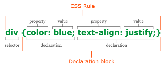
There are three ways to apply CSS to HTML: Inline, internal, and external.
1. Inline CSS:
Inline CSS is specified directly in the opening tag of the element you want it to apply to. It is entered into the style attribute within HTML. This allows CSS properties on a "per tag" basis.
Example:
<p style="font-weight:bold;">Bold Font</p>
This CSS type is not really recommended, as each HTML tag needs to be styled individually. However, inline CSS in HTML can be useful in some situations. For example, in cases where you don't have access to CSS files or need to apply styles for a single element only.
2. Internal CSS:
Internal or Embedded, styles are used for the whole page. Inside the head element, the style tags surround all of the styles for the page.
Example:
<!DOCTYPE html>
<html>
  <head>
    <title>Internal CSS Example</title>
  <style>
    p {
        color: red;
    }

    a {
        color: blue;
    }
</style>
...
This CSS style is an effective method of styling a single page. However, using this style for multiple pages is time-consuming as you need to put CSS rules to every page of your website.
3. External CSS:
In external CSS rules are stored in a separate file. To refer to that file from the HTML page, add the link element (and its closing element within XHTML) to the head element. This CSS type is a more efficient method, especially for styling a large website. By editing one .css file, you can change your entire site at once.
style.css:
  p {
      color: red;
  }

  a {
      color: blue;
  }
<!DOCTYPE html>
<html>
<head>
    <title>External CSS Example</title>
    <link rel="stylesheet" type="text/css" href="style.css">
...
The link element in the example has three attributes. The first, rel, tells the browser the type of the target of the link. The second, type, tells the browser what type of stylesheet it is. And the third, href, tells the browser under which URL to find the stylesheet.
The cascading in CSS refers to the fact that styling rules "cascade" down from several sources. This means that CSS has an inherent hierarchy and styles of a higher precedence will overwrite rules of a lower precedence.
Even the simplest HTML document may have three or more style sheets associated with it including:
1. Browser style sheets:
Browsers apply style sheets to all web documents. Although these style sheets vary from browser to browser, they all have common characteristics such as black text, blue links, purple visited links etc. These are referred to as a "default" browser stylesheet.
As soon as you, the author, apply a style sheet to a document, it will override the browser's style sheet. This is because author style sheets will always override browser style sheets.
2. User style sheets:
Most modern browsers allow users to set their own style sheets within their browser. These style sheets will override the browsers default style sheets - for that user only.
3. Author style sheets:
As soon as you apply a basic style sheet or an inline style to a page, you have added what is referred to as an "author style sheet". Everything you do, from choosing fonts, colours and laying out pages in CSS is done using author style sheets.
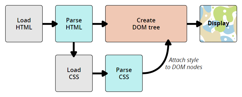
The CSS language is designed to be used alongside a "markup" language like HTML. CSS defines how HTML elements are formatted – controlling their layout, colors, fonts, and so on. When a browser displays a document, it must combine the document's content with its style information. It processes the document in a number of stages, which we've listed below.
The following diagram also offers a simple view of the process.
The DOM and CSSOM:
A DOM has a tree-like structure. Each element, attribute, and piece of text in the markup language becomes a DOM node in the tree structure. The nodes are defined by their relationship to other DOM nodes. Some elements are parents of child nodes, and child nodes have siblings. The browser undergo a process that includes conversion, tokenization, lexing, and parsing which ultimately constructs the DOM and CSSOM.
Example: DOM Representation
<p>
  Let\'s use:
  <span>Cascading</span>
  <span>Style</span>
  <span>Sheets</span>
</p>
In the DOM, the node corresponding to our <p> element is a parent. Its children are a text node and the three nodes corresponding to our <span> elements. The SPAN nodes are also parents, with text nodes as their children:
P
├─ "Let\'s use:"
├─ SPAN
|  └─ "Cascading"
├─ SPAN
|  └─ "Style"
└─ SPAN
   └─ "Sheets"
Applying CSS to the DOM
span {
  border: 1px solid black;
  background-color: lime;
}
Once both tree structures are created, the rendering engine then attaches the data structures into what's called a render tree as part of the layout process. The render tree is a visual representation of the document which enable painting the contents of the page in their correct order.
Render tree construction follows the following order:
The CSS box model is a rectangular layout paradigm for HTML elements that consists of the following:
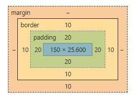
The size of the box itself is calculated like this:
| Property | Total |
|---|---|
| Width | width + padding-left + padding-right + border-left + border-right |
| Height | height + padding-top + padding-bottom + border-top + border-bottom |
Example:
<!DOCTYPE html>
<html>
<head>
  <title>CSS Box Model</title>
  <style>
    div {
      background-color: lightgrey;
      width: 300px;
      border: 10px solid rgb(3, 141, 233);
      padding: 50px;
      margin: 20px;
    }
  </style>
</head>
<body>
  <h2>CSS Box Model</h2>

  <p>The CSS box model is essentially a box that wraps around every HTML element.
    It consists of: borders, padding, margins, and the actual content.</p>

  <div>This text is the content of the box. We have added a 50px padding, 20px margin and a 10px blue
    border.</div>
</body>
</html>
Live Demo: CSS Box Model
box-sizing: content-box and box-sizing: border-box?The box-sizing property controls how the total width and height of an element is calculated.
| Property | Width Calculation |
|---|---|
content-box (default) |
width = content only. Padding and border are added on top. |
border-box |
width = content + padding + border. They are included inside the declared width. |
Example:
/* content-box (default): total rendered width = 200 + 20 + 20 + 5 + 5 = 250px */
.box-content {
  box-sizing: content-box;
  width: 200px;
  padding: 20px;
  border: 5px solid #333;
}

/* border-box: total rendered width = 200px */
.box-border {
  box-sizing: border-box;
  width: 200px;
  padding: 20px;
  border: 5px solid #333;
}
A common best practice is to apply border-box globally:
*, *::before, *::after {
  box-sizing: border-box;
}
Margin collapsing occurs when the top and bottom margins of block-level elements combine into a single margin equal to the larger of the two values.
Scenarios where margin collapsing occurs:
1. Adjacent siblings: The bottom margin of one element collapses with the top margin of the next sibling.
.first  { margin-bottom: 20px; }
.second { margin-top: 30px; }
/* Actual gap between them = 30px (not 50px) */
2. Parent and first/last child: If there is no border, padding, or block formatting context separating a parent's top margin from its first child's top margin, they collapse.
.parent { margin-top: 20px; }
.child  { margin-top: 40px; }
/* Parent\'s effective top margin = 40px */
3. Empty blocks: A block with no height, border, or padding collapses its own top and bottom margins.
How to prevent margin collapsing:
padding or border to the parent.overflow: hidden or overflow: auto on the parent (creates a Block Formatting Context).display: flex or display: grid on the parent.padding and margin?| Feature | Padding | Margin |
|---|---|---|
| Location | Inside the border (between content and border) | Outside the border (between elements) |
| Background | Inherits the element's background color | Always transparent |
| Collapsing | Does not collapse | Can collapse (vertical margins between blocks) |
| Negative values | Not allowed | Allowed |
box-sizing effect |
Included in width with border-box |
Never included in width calculation |
Example:
.box {
  margin: 20px;   /* space outside the element */
  padding: 15px;  /* space inside the element, within the border */
  border: 2px solid #333;
  background-color: lightblue; /* covers padding area, not margin area */
}
A Block Formatting Context (BFC) is an independent rendering region where block boxes are laid out according to normal flow rules. Elements inside a BFC do not affect the layout of elements outside it.
A BFC is created by:
overflow value other than visible (e.g., hidden, auto, scroll)display: flow-rootdisplay: flex or display: grid (on the container)position: absolute or position: fixedfloat: left or float: rightUse cases:
/* Creates a BFC to contain floated children */
.container {
  overflow: hidden; /* or display: flow-root */
}

.float-child {
  float: left;
  width: 50%;
}
outline differ from border in the CSS box model?| Feature | border |
outline |
|---|---|---|
| Affects layout | Yes — takes up space, increases element size (in content-box) |
No — does not affect layout or box size |
| Part of the box model | Yes | No |
| Can be offset | No | Yes — via outline-offset |
| Rounded corners | Yes — via border-radius |
No (in most browsers) |
| Per-side control | Yes (border-top, border-right, etc.) |
No |
| Common use | Visual decoration, card borders | Focus indicators for accessibility |
button {
  border: 2px solid blue;    /* takes up space */
  outline: 3px dashed red;   /* does NOT take up space */
  outline-offset: 4px;       /* gap between element and outline */
}
With the default box-sizing: content-box:
$$\text{Total Width} = \text{width} + \text{padding-left} + \text{padding-right} + \text{border-left} + \text{border-right} + \text{margin-left} + \text{margin-right}$$
$$\text{Total Height} = \text{height} + \text{padding-top} + \text{padding-bottom} + \text{border-top} + \text{border-bottom} + \text{margin-top} + \text{margin-bottom}$$
Example:
div {
  width: 300px;
  height: 150px;
  padding: 10px;
  border: 5px solid #000;
  margin: 20px;
}
With box-sizing: border-box, the rendered width equals the declared width (300px), and padding/border are subtracted from the content area.
Top and bottom margins do not affect inline elements because inline elements flow with content on the page. You can set left and right margins/padding on an inline element but not top or bottom because it would disrupt the flow of content. You can set margins on block (or inline-block but it will only look right if you set the vertical align right) because block level elements disrupt the flow of content.
Example:
<!DOCTYPE html>
<html>
  <head>
    <title>Separator</title>
  </head>
  <style>
    .separator {
      border: 1px solid #333;
      margin: 10px;
    }
  </style>
  <body>
    <div>
        <span>Hello</span>
        <span class="separator"></span>
        <span>World</span>
    </div>
  </body>
</html>
Live Demo: Inline Elements
The box-sizing property allows us to include the padding and border in an element's total width and height. If you set box-sizing: border-box; on an element, padding and border are included in the width and height
Syntax:
box-sizing: content-box|border-box|initial|inherit;
Property Values:
| Value | Description |
|---|---|
| content-box | Default. The width and height properties (and min/max properties) includes only the content. Border and padding are not included |
| border-box | The width and height properties (and min/max properties) includes content, padding and border |
| initial | Sets this property to its default value. Read about initial |
| inherit | Inherits this property from its parent element. Read about inherit |
Example:
<!DOCTYPE html>
<html>
<head>
  <title>The box-sizing Property</title>
  <style>
    .content-box {
        box-sizing: content-box;
        width: 300px;
        height: 100px;
        padding: 30px;
        border: 10px solid rgb(0, 89, 255);
    }

    .border-box {
        box-sizing: border-box;
        width: 300px;
        height: 100px;
        padding: 30px;
        border: 10px solid rgb(255, 102, 0);
    }
  </style>
</head>
<body>
    <h2>The box-sizing Property</h2>
    <p>Defines how the width and height of an element are calculated: should they include padding
      and borders, or not.</p>

    <h3>1. box-sizing: content-box (default):</h3>
    <p>Width and height only apply to the content of the element:</p>
    <div class="content-box">This div has a width of 300px. But the full width is 300px + 20px
      (left and right border) + 60px (left and right padding) = 380px!</div>

    <h3>2. box-sizing: border-box:</h3>
    <p>Width and height apply to all parts of the element: content, padding and borders:</p>
    <div class="border-box">Here, the full width is 300px</div>
</body>
</html>
1. content-box:
Default box-sizing property. The width and height properties (and min/max properties) includes only the content. Border and padding are not included
2. border-box:
The width and height properties (and min/max properties) includes content, padding and border.
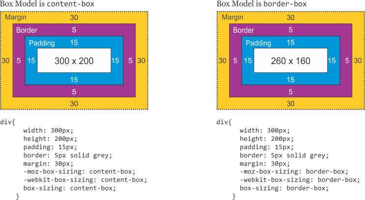
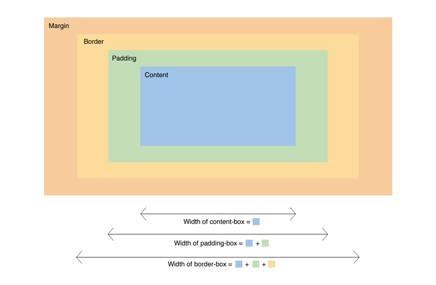
The box-sizing CSS property sets how the total width and height of an element is calculated.
Example:
box-sizing: content-box;
width: 100%;
border: solid rgb(90,107,204) 10px;
padding: 5px;
* { box-sizing: border-box; } do? What are its advantages?box-sizing: content-box applied, and only the content size is being accounted for.box-sizing: border-box changes how the width and height of elements are being calculated, border and padding are also being included in the calculation.height of an element is now calculated by the content's height + vertical padding + vertical border width.width of an element is now calculated by the content's width + horizontal padding + horizontal border width.paddings and borders as part of our box model resonates better with how designers actually imagine content in grids.1) Margin is applied to the outside of you element hence effecting how far your element is away from other elements.
2) Padding is applied to the inside of your element hence effecting how far your element's content is away from the border.
Also, using margin will not affect your element's dimensions whereas padding will make your elements dimensions (set height + padding) so for example if you have a 100x100px div with a 5 px padding, your div will actually be 105x105px
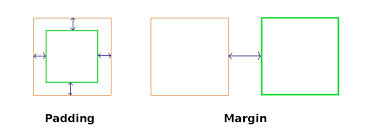
Note: Top/Bottom margins are collapsible: if you have a 20px margin at the bottom of an element and a 30px margin at the top of the next element, the margin between the two elements will be 30px rather than 50px. This does not apply to left/right margin or padding.
A CSS selector is the part of a CSS rule set that actually selects the content you want to style.
i) Universal Selector: The universal selector works like a wild card character, selecting all elements on a page. Every HTML page is built on content placed within HTML tags. Each set of tags represents an element on the page.
* {
   color: green;
   font-size: 20px;
   line-height: 25px;
}
ii) Element Type Selector: This selector match one or more HTML elements of the same name.
ul {
   list-style: none;
   border: solid 1px #ccc;
}
<ul>
  <li>Fish</li>
  <li>Apples</li>
  <li>Cheese</li>
</ul>

<div class="example">
  <p>Example paragraph text.</p>
</div>

<ul>
  <li>Water</li>
  <li>Juice</li>
  <li>Maple Syrup</li>
</ul>
iii) ID Selector: This selector matches any HTML element that has an ID attribute with the same value as that of the selector.
#container {
   width: 960px;
   margin: 0 auto;
}
<div id="container"></div>
iv) Class Selector: The class selector also matches all elements on the page that have their class attribute set to the same value as the class.
.box {
   padding: 20px;
   margin: 10px;
   width: 240px;
}
<div class="box"></div>
v) Descendant Combinator: The descendant selector or, more accurately, the descendant combinator lets you combine two or more selectors so you can be more specific in your selection method.
#container .box {
   float: left;
   padding-bottom: 15px;
}
This declaration block will apply to all elements that have a class of box that are inside an element with an ID of container. It's worth noting that the .box element doesn't have to be an immediate child: there could be another element wrapping .box, and the styles would still apply.
<div id="container">
  <div class="box"></div>

  <div class="box-2"></div>
</div>

<div class="box"></div>
vi) Child Combinator: A selector that uses the child combinator is similar to a selector that uses a descendant combinator, except it only targets immediate child elements.
#container > .box {
   float: left;
   padding-bottom: 15px;
}
The selector will match all elements that have a class of box and that are immediate children of the #container element. That means, unlike the descendant combinator, there can't be another element wrapping .box—it has to be a direct child element.
<div id="container">
  <div class="box"></div>

  <div>
    <div class="box"></div>
  </div>
</div>
vii) General Sibling Combinator: A selector that uses a general sibling combinator matches elements based on sibling relationships. The selected elements are beside each other in the HTML.
h2 ~ p {
   margin-bottom: 20px;
}
In this example, all paragraph elements (<p>) will be styled with the specified rules, but only if they are siblings of <h2> elements. There could be other elements in between the <h2> and <p>, and the styles would still apply.
<h2>Title</h2>
<p>Paragraph example.</p>
<p>Paragraph example.</p>
<p>Paragraph example.</p>
<div class="box">
  <p>Paragraph example.</p>
</div>
viii) Adjacent Sibling Combinator: A selector that uses the adjacent sibling combinator uses the plus symbol (+), and is almost the same as the general sibling selector. The difference is that the targeted element must be an immediate sibling, not just a general sibling.
p + p {
   text-indent: 1.5em;
   margin-bottom: 0;
}
In this example will apply the specified styles only to paragraph elements that immediately follow other paragraph elements. This means the first paragraph element on a page would not receive these styles. Also, if another element appeared between two paragraphs, the second paragraph of the two wouldn't have the styles applied.
<h2>Title</h2>
<p>Paragraph example.</p>
<p>Paragraph example.</p>
<p>Paragraph example.</p>

<div class="box">
  <p>Paragraph example.</p>
  <p>Paragraph example.</p>
</div>
ix) Attribute Selector: The attribute selector targets elements based on the presence and/or value of HTML attributes, and is declared using square brackets
input[type="text"] {
   background-color: #444;
   width: 200px;
}
<input type="text">
The attribute selector can also be declared using just the attribute itself, with no value, like this:
input[type] {
   background-color: #444;
   width: 200px;
}
x) Pseudo-class: A pseudo-class uses a colon character to identify a pseudo-state that an element might be in—for example, the state of being hovered, or the state of being activated.
a:hover {
   color: red;
}
xi) Pseudo-element: A CSS pseudo-element is used to style specified parts of an element. For example, it can be used to:
<!DOCTYPE html>
<html>
  <head>
    <style>
      p::first-line {
        color: #ff0000;
        font-variant: small-caps;
      }

      p::first-letter {
        color: #ff0000;
        font-size: xx-large;
      }

      h1::before {
        content: url(smiley.gif);
      }

      h1::after {
        content: url(smiley.gif);
      }

      ::selection {
        color: red;
        background: yellow;
      }
    </style>
  </head>
<body>
  <p>Lorem Ipsum is simply dummy text of the printing and typesetting industry.
  Lorem Ipsum has been the industry\'s standard dummy text ever since the 1500s,
  <h1>when an unknown printer took a galley of type and scrambled it to make a
  type specimen book.<h1></p>
</body>
</html>
Live Demo: CSS Selectors
A contextual selector targets an element only when it appears within a specific context (ancestor). It's a string of selectors separated by whitespace, where only the last element is styled — but only if it matches the specified ancestral path.
Example:
table p { color: red; }
This styles <p> elements only when they are descendants of a <table> — not all <p> elements on the page.
A pseudo-class is a selector that assists in the selection of something that cannot be expressed by a simple selector, for example :hover. A pseudo-element however allows us to create items that do not normally exist in the document tree, for example ::after.
Pseudo-classes:
Pseudo-classes select regular elements but under certain conditions, like when their position relative to siblings or when they're under a particular state. Here is a list of pseudo-classes in CSS3:
a) Dynamic pseudo-classes:
b) UI element states pseudo-classes:
c) Structural pseudo-classes:
d) Other pseudo-classes:
:not(x) :target :lang(language)
Pseudo-elements:
Pseudo-elements effectively create new elements that are not specified in the markup of the document and can be manipulated much like a regular element.
A combinator is the character in a selector that connects two selectors together. There are four types of combinators.
a) Descendant Combinator (space): The descendant selector matches all elements that are descendants of a specified element.
The following example selects all <p> elements inside <div> elements:
div p {
  background-color: yellow;
}
b) Child Combinator (>): The child selector selects all elements that are the children of a specified element.
The following example selects all <p> elements that are children of a <div> element:
div > p {
  background-color: yellow;
}
c) Adjacent Sibling Combinator (+): The adjacent sibling selector selects all elements that are the adjacent siblings of a specified element.
The following example selects all <p> elements that are placed immediately after <div> elements:
div + p {
  background-color: yellow;
}
d) General Sibling Combinator (~): The general sibling selector selects all elements that are siblings of a specified element.
The following example selects all <p> elements that are siblings of <div> elements:
div ~ p {
  background-color: yellow;
}
In the CSS, a class selector is a name preceded by a full stop (".") and an ID selector is a name preceded by a hash character ("#"). The difference between an ID and a class is that an ID can be used to identify one element, whereas a class can be used to identify more than one.
#top {
    background-color: #ccc;
    padding: 20px
}

.intro {
    color: red;
    font-weight: bold;
}
<div id="top">
  <h1>Welcome to the CSS3 Tutorial</h1>
  <p class="intro">Select element by class</p>
  <p class="intro">Example for class selector paragraph</p>
</div>
The nth-child() pseudo-class is used to match an element based on a number, which represents the element's position amongst it's siblings. More specifically, the number represents the number of siblings that exist before the element in the document tree (minus 1).
Example:
.example :nth-child(4) { background: #ffdb3a; }
<div class="example">
  <p>This is a <em>paragraph</em>.</p>
  <p>This is a <em>paragraph</em>.</p>
  <p>This is a <em>paragraph</em>.</p>
  <div>This is a <em>divider</em>.</div> <!-- Element to select -->
  <div>This is a <em>divider</em>.</div>
</div>
The nth-of-type() pseudo-class, like nth-child(), is used to match an element based on a number. This number, however, represents the element's position within only those of its siblings that are of the same element type.
This number can also be expressed as a function, or using the keywords even or odd.
.example p:nth-of-type(odd) { background: #ffdb3a; }
<div class="example">
  <p>This is a <em>paragraph</em>.</p> <!-- Element to select -->
  <p>This is a <em>paragraph</em>.</p>
  <p>This is a <em>paragraph</em>.</p> <!-- Element to select -->
  <div>This is a <em>divider</em>.</div>
  <div>This is a <em>divider</em>.</div> <!-- Element to select -->
</div>
Specificity is the algorithm browsers use to determine which CSS rule takes precedence when multiple rules target the same element.
Specificity Hierarchy (lowest → highest)
| Selector Type | Example | Value |
|---|---|---|
| Universal selector | * |
0 |
| Element / pseudo-element | h1, ::before |
0-0-1 |
| Class / attribute / pseudo-class | .box, [type], :hover |
0-1-0 |
| ID selector | #header |
1-0-0 |
| Inline style | style="..." |
Always wins |
!important |
color: red !important |
Overrides all |
Key Rules
Higher specificity wins, regardless of order.
If specificity is equal, the last rule declared wins.
A class beats any number of element selectors:
.intro {}              /* wins */
html body div div p {} /* loses */
ID beats any number of classes:
#main { color: red; }       /* wins */
.box.card.active { color: blue; } /* loses */
Example
a#nav-link.active:hover { color: red; }
/* ID=1, Class=2 (active + hover), Element=1 → specificity: 1-2-1 */
<a> element whose href attribute value begins with "https". a[href^="https"]
<a> element whose href attribute value ends with ".pdf". a[href$=".pdf"]
<a> element whose href attribute value contains the substring "css". a[href*="css"]
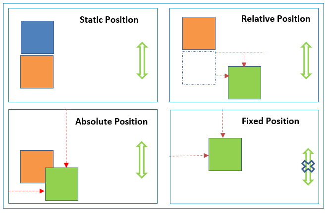
absolute, place an element exactly where you want to place it. absolute position is actually set relative to the element's parent. if no parent available then relatively place to the page itself (it will default all the way back up to the element).
relative, means "relative to itself". Setting position: relative; on an element and no other positioning attributes, it will no effect on it's positioning. It allows the use of z-index on the element and it limits the scope of absolutely positioned child elements. Any child element will be absolutely positioned within that block.
fixed, element is positioned relative to viewport or the browser window itself. viewport doesn't changed if you scroll and hence fixed element will stay right in the same position.
static default for every single page element. The only reason you would ever set an element to position: static is to forcefully-remove some positioning that got applied to an element outside of your control.
sticky - Sticky positioning is a hybrid of relative and fixed positioning. The element is treated as relative positioned until it crosses a specified threshold, at which point it is treated as fixed positioned.
Live Demo: CSS Position Property
Relative Position
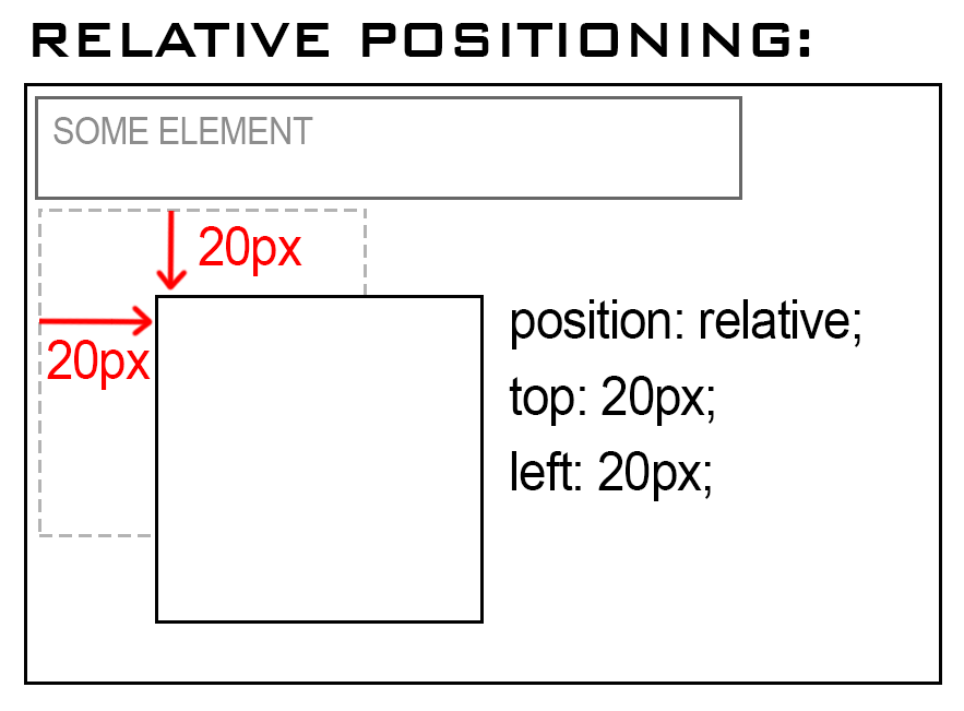
An element with position: relative; is positioned relative to its normal position.
Setting the top, right, bottom, and left properties of a relatively-positioned element will cause it to be adjusted away from its normal position. Other content will not be adjusted to fit into any gap left by the element.
Example:
<!DOCTYPE html>
<html>
<head>
  <title>Relative Position</title>
  <style>
    div.relative {
      position: relative;
      top: 20px;
      left: 20px;
      border: 3px solid #2321ad;
    }
  </style>
</head>
<body>
    <h2>position: relative;</h2>
    <p>An element with position: relative; is positioned relative to its normal position:</p>

    <div class="relative">
        This div element has position: relative;
    </div>
</body>
</html>
Live Demo: Relative Position Property
Absolute Position:
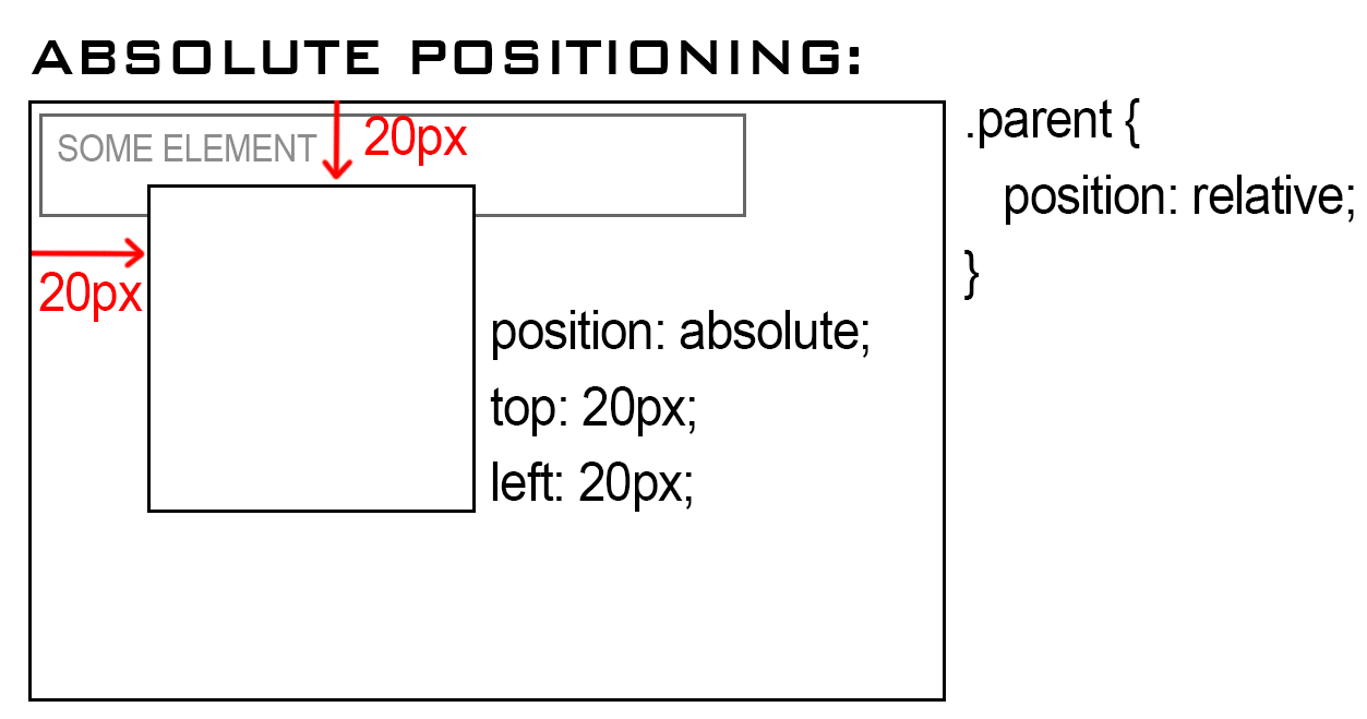
An element with position: absolute; will cause it to adjust its position with respect to its parent. If no parent is present, then it uses the document body as parent.
Example:
<!DOCTYPE html>
<html>
<head>
  <title>Absolute Position</title>
  <style>
    div.relative {
      position: relative;
      width: 400px;
      height: 200px;
      border: 3px solid #2321ad;
    }

    div.absolute {
      position: absolute;
      top: 80px;
      right: 0;
      width: 200px;
      height: 100px;
      border: 3px solid #ee0b0b;
    }
  </style>
</head>
<body>
    <h2>position: absolute;</h2>

    <p>An element with position: absolute; is positioned relative to the nearest positioned ancestor
      (instead of positioned relative to the viewport, like fixed):</p>

    <div class="relative">This div element has position: relative;
        <div class="absolute">This div element has position: absolute;</div>
    </div>
</body>
</html>
Live Demo: Absolute Position Property
| Keyword | Value | Description |
|---|---|---|
| position | static | The default mode, block element is positioned in the flow. Top, left etc. are ignored. |
| position | relative | The block element is positioned relative to its position in the flow. |
| position | absolute | Block element is positioned relative to its container. |
| position | fixed | Block element is positioned relative to the window and won't scroll. |
| top | Number [px, cm, in…] | Positions the block down from the reference point at the specified distance. |
| bottom | Number [px, cm, in…] | Positions the block up from the reference point at the specified distance. |
| left | Number [px, cm, in…] | Positions the block right from the reference point at the specified distance. |
| right | Number [px, cm, in…] | Positions the block left from the reference point at the specified distance. |
Centering is one of the most common CSS interview tasks. The best approach depends on context.
1. Flexbox (most common, recommended):
.parent {
  display: flex;
  justify-content: center; /* horizontal */
  align-items: center;     /* vertical */
}
2. CSS Grid:
.parent {
  display: grid;
  place-items: center; /* shorthand for align-items + justify-items */
}
3. Absolute positioning + transform (does not require knowing dimensions):
.parent { position: relative; }

.child {
  position: absolute;
  top: 50%;
  left: 50%;
  transform: translate(-50%, -50%);
}
4. Absolute positioning + inset + margin: auto (modern, clean):
.parent { position: relative; }

.child {
  position: absolute;
  inset: 0;          /* top: 0; right: 0; bottom: 0; left: 0 */
  margin: auto;
  width: 200px;      /* must have explicit dimensions */
  height: 100px;
}
5. margin: auto for horizontal centering of block elements:
.child {
  width: 300px;
  margin: 0 auto; /* horizontally centers a block element */
}
6. text-align: center for inline/inline-block children:
.parent {
  text-align: center;
}
.child {
  display: inline-block;
}
7. CSS table-cell technique (legacy):
.parent {
  display: table-cell;
  vertical-align: middle;
  text-align: center;
}
| Technique | Horizontal | Vertical | Notes |
|---|---|---|---|
| Flexbox | ✅ | ✅ | Best for most cases |
Grid place-items |
✅ | ✅ | Cleaner shorthand |
| Absolute + transform | ✅ | ✅ | Works without known size |
| Absolute + inset + margin | ✅ | ✅ | Needs explicit width/height |
margin: auto |
✅ | ❌ | Block elements only |
text-align: center |
✅ | ❌ | Inline children only |
position: sticky work and what are its common pitfalls?position: sticky is a hybrid between relative and fixed. The element is positioned relative to the normal flow until it crosses a specified threshold (e.g., top: 0), at which point it "sticks" and behaves like position: fixed within its scroll container.
.sticky-header {
  position: sticky;
  top: 0;          /* sticks when it reaches the top of the viewport */
  z-index: 100;
  background: white;
}
How it differs from position: fixed:
| Feature | sticky |
fixed |
|---|---|---|
| Stays in document flow | Yes — occupies original space | No — removed from flow |
| Constrained to parent | Yes — stops sticking when parent scrolls away | No — always relative to viewport |
| Needs offset property | Yes (top, left, etc.) |
Yes |
Common pitfalls:
overflow: hidden or overflow: auto on an ancestor breaks sticky. The sticky element scrolls with the overflow container, not the viewport./* ❌ This breaks sticky */
.parent { overflow: hidden; }
.child { position: sticky; top: 0; }
/* ✅ Fix: remove overflow from the ancestor or use overflow: clip */
.parent { overflow: clip; } /* clip does not create a scroll container */
No explicit offset set — position: sticky with no top/bottom/left/right behaves like relative.
Parent is not taller than the child — sticking requires the parent to be scrollable past the child.
Missing z-index — sticky elements may be covered by sibling elements that follow in the DOM.
/* Sticky table headers */
thead th {
  position: sticky;
  top: 0;
  background: #fff;
  z-index: 1;
}
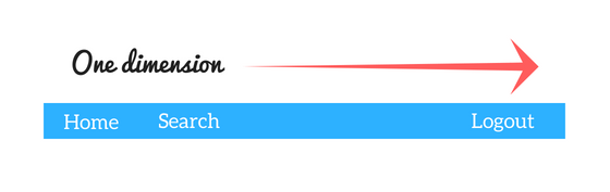
The Flexible Box Layout Module, makes it easier to design flexible responsive layout structure without using float or positioning. Flexbox makes it simple to align items vertically and horizontally using rows and columns. Items will "flex" to different sizes to fill the space.
Before the Flexbox Layout module, there were four layout modes:
Flex Container:
An area of a document laid out using flexbox is called a flex container. To create a flex container, we set the value of the area's container's display property to flex or inline-flex. As soon as we do this the direct children of that container become flex items.
Flexbox Terminology:
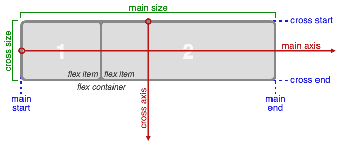
The CSS Flexbox Container Properties:
| Property | Values |
|---|---|
| display: | flexbox, inline-flex; |
| flex-direction: | row, row-reverse, column, column-reverse; |
| flex-wrap: | nowrap, wrap, wrap-reverse; |
| flex-flow: | <‘flex-direction’>, <‘flex-wrap’> |
| justify-content: | flex-start, flex-end, center, space-between, space-around; |
| align-items: | flex-start, flex-end, center, baseline, stretch; |
| align-content: | flex-start, flex-end, center, space-between, space-around, stretch; |
The CSS Flexbox Properties:
| Property | Values |
|---|---|
| order: | <integer>; |
| flex-grow: | <number>; /* default 0 */ |
| flex-shrink: | <number>; /* default 1 */ |
| flex-basis: | <length>, auto; /* default auto */ |
| flex: | none, [ <'flex-grow'> <'flex-shrink'>? |
| align-self: | auto, flex-start, flex-end, center, baseline, stretch; |
Example:
<!DOCTYPE html>
<html>
<head>
    <title>The flex-direction Property</title>
    <style>
        .flex-container {
            display: flex;
            flex-direction: column;
            background-color: DodgerBlue;
        }

        .flex-container>div {
            background-color: #f1f1f1;
            width: 100px;
            margin: 10px;
            text-align: center;
            line-height: 75px;
            font-size: 30px;
        }
    </style>
</head>
<body>
    <h1>The flex-direction Property</h1>
    <p>The "flex-direction: column;" stacks the flex items vertically (from top to bottom):</p>

    <div class="flex-container">
        <div>1</div>
        <div>2</div>
        <div>3</div>
    </div>
</body>
</html>
Live Demo: flex-direction Property
flex-grow, flex-shrink, and flex-basis?These three properties control how a flex item sizes itself relative to the available space in the flex container. The flex shorthand combines all three.
| Property | Default | Description |
|---|---|---|
flex-grow |
0 |
How much the item grows relative to others when extra space is available |
flex-shrink |
1 |
How much the item shrinks relative to others when space is insufficient |
flex-basis |
auto |
The initial main size of the item before growing/shrinking |
flex-grow example:
.container { display: flex; width: 600px; }

.item-a { flex-grow: 1; }  /* takes 1/3 of extra space */
.item-b { flex-grow: 2; }  /* takes 2/3 of extra space */
.item-c { flex-grow: 0; }  /* does NOT grow (default) */
If all items have flex-grow: 1, they share the container equally. If one has flex-grow: 2, it gets twice as much of the remaining space.
flex-shrink example:
.container { display: flex; width: 400px; }

.item-a { width: 300px; flex-shrink: 1; } /* shrinks normally */
.item-b { width: 300px; flex-shrink: 3; } /* shrinks 3× as fast */
/* Total content = 600px, container = 400px → 200px overflow to distribute */
flex-basis example:
.item { flex-basis: 200px; }  /* start size is 200px before grow/shrink */
.item { flex-basis: 0; }      /* size starts at 0; all space from grow/shrink */
.item { flex-basis: auto; }   /* use the item\'s width/height (default) */
The flex shorthand:
/* flex: <flex-grow> <flex-shrink> <flex-basis> */
.item { flex: 1 1 auto; }   /* can grow and shrink, starts at auto size */
.item { flex: 1; }          /* shorthand for: 1 1 0 (equal sizing) */
.item { flex: none; }       /* shorthand for: 0 0 auto (no grow, no shrink) */
.item { flex: auto; }       /* shorthand for: 1 1 auto */
flex: 1vsflex: 1 1 auto:flex: 1setsflex-basis: 0, so items split the container total evenly.flex: 1 1 autouses the item's intrinsic size as a starting point.
align-items, align-content, align-self, and justify-content in Flexbox?These properties control alignment along the cross axis (align-) and main axis (justify-).
| Property | Applies to | Axis | What it aligns |
|---|---|---|---|
justify-content |
Container | Main axis | All items as a group |
align-items |
Container | Cross axis | Items in a single line |
align-content |
Container | Cross axis | Multiple lines (only when flex-wrap is active) |
align-self |
Individual item | Cross axis | Overrides align-items for that one item |
justify-self |
Individual item | Main axis | Not supported in Flexbox (use margin: auto) |
align-items vs align-content:
/* align-items: controls how items align within their row */
.container {
  display: flex;
  flex-wrap: wrap;
  align-items: center;    /* centres items vertically within each row */
}

/* align-content: controls how rows align within the container */
.container {
  display: flex;
  flex-wrap: wrap;
  height: 400px;
  align-content: space-between; /* distributes rows vertically with space */
}
align-self overriding align-items:
.container {
  display: flex;
  align-items: flex-start; /* default for all children */
}

.special {
  align-self: flex-end;    /* this one item overrides to bottom */
}
Centering with margin: auto (justify-self workaround):
.container { display: flex; }

/* Push last item to the far right (main-axis auto margin) */
.push-right { margin-left: auto; }
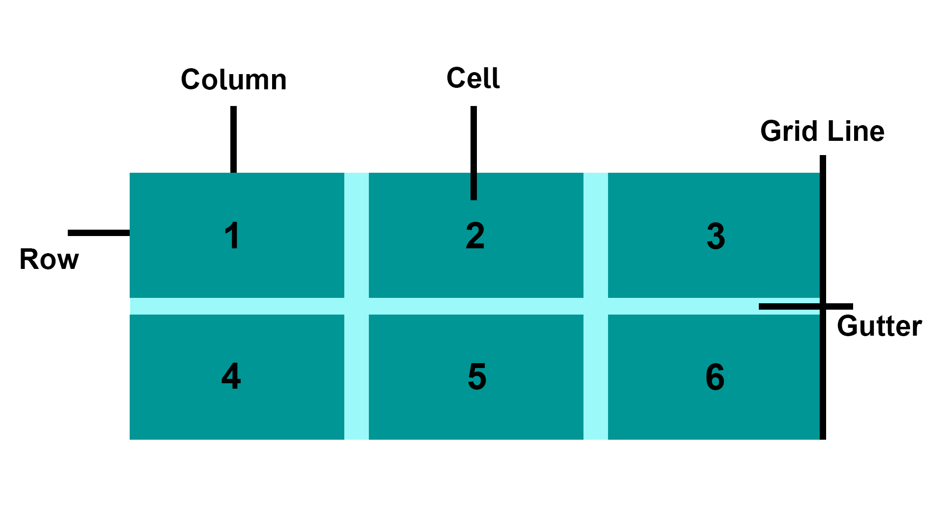
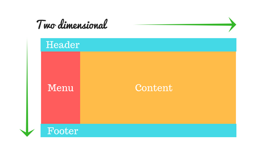
CSS Grid Layout excels at dividing a page into major regions or defining the relationship in terms of size, position, and layer, between parts of a control built from HTML primitives. Like tables, grid layout enables us to align elements into columns and rows.
Basic Terminology:
CSS Grid Properties:
| Property | Description |
|---|---|
| column-gap | Specifies the gap between the columns |
| gap | A shorthand property for the row-gap and the column-gap properties |
| grid | A shorthand property for the grid-template-rows, grid-template-columns, grid-template-areas, grid-auto-rows, grid-auto-columns, and the grid-auto-flow properties |
| grid-area | Either specifies a name for the grid item, or this property is a shorthand property for the grid-row-start, grid-column-start, grid-row-end, and grid-column-end properties |
| grid-auto-columns | Specifies a default column size |
| grid-auto-flow | Specifies how auto-placed items are inserted in the grid |
| grid-auto-rows | Specifies a default row size |
| grid-column | A shorthand property for the grid-column-start and the grid-column-end properties |
| grid-column-end | Specifies where to end the grid item |
| grid-column-gap | Specifies the size of the gap between columns |
| grid-column-start | Specifies where to start the grid item |
| grid-gap | A shorthand property for the grid-row-gap and grid-column-gap properties |
| grid-row | A shorthand property for the grid-row-start and the grid-row-end properties |
| grid-row-end | Specifies where to end the grid item |
| grid-row-gap | Specifies the size of the gap between rows |
| grid-row-start | Specifies where to start the grid item |
| grid-template | A shorthand property for the grid-template-rows, grid-template-columns and grid-areas properties |
| grid-template-areas | Specifies how to display columns and rows, using named grid items |
| grid-template-columns | Specifies the size of the columns, and how many columns in a grid layout |
| grid-template-rows | Specifies the size of the rows in a grid layout |
| row-gap | Specifies the gap between the grid rows |
Example:
<!DOCTYPE html>
<html>
<head>
  <title>Grid Layout</title>
  <style>
    .item1 {
        grid-area: header;
    }

    .item2 {
        grid-area: menu;
    }

    .item3 {
        grid-area: main;
    }

    .item4 {
        grid-area: right;
    }

    .item5 {
        grid-area: footer;
    }

    .grid-container {
        display: grid;
        grid-template-areas:
            'header header header header header header'
            'menu main main main right right'
            'menu footer footer footer footer footer';
        grid-gap: 10px;
        background-color: rgba(155, 249, 249);
        padding: 10px;
    }

    .grid-container>div {
        background-color: rgba(0, 150, 149);
        text-align: center;
        padding: 20px 0;
        font-size: 30px;
    }
  </style>
  </head>
<body>
  <h1>Grid Layout</h1>
  <p>This grid layout contains six columns and three rows:</p>

  <div class="grid-container">
    <div class="item1">Header</div>
    <div class="item2">Menu</div>
    <div class="item3">main</div>
    <div class="item4">Right</div>
    <div class="item5">Footer</div>
  </div>
</body>
</html>
Live Demo: Grid Layout
Example:
<!DOCTYPE html>
<html>
  <head>
    <title>Grid vs Flexbox Layout</title>
  </head>
  <style>
    /* Grid layout */
    .row {
        display: grid;
        grid-template-columns: auto auto auto;
        background-color: #2196f3;
        padding: 5px;
    }

    .col-item {
        background-color: rgba(255, 255, 255, 0.8);
        border: 1px solid rgba(0, 0, 0, 0.8);
        padding: 10px;
        font-size: 30px;
        text-align: center;
    }

    /* Flexbox layout */
    .wrapper {
        border: 2px solid #f76707;
        border-radius: 5px;
        background-color: #fff4e6;
    }

    .wrapper > div {
        border: 2px solid #ffa94d;
        border-radius: 5px;
        background-color: #ffd8a8;
        padding: 1em;
        color: #d9480f;
    }

    .wrapper {
        display: flex;
        width: 500px;
        flex-wrap: wrap;
    }

    .wrapper > div {
        flex: 1 1 150px;
    }
  </style>
  <body>
    <p><h1>Grid Layout Example<hr/></h1></p>
    <div class="row">
        <div class="col-item">Column - 1</div>
        <div class="col-item">Column - 2</div>
        <div class="col-item">Column - 3</div>
        <div class="col-item">Column - 1</div>
        <div class="col-item">Column - 2</div>
        <div class="col-item">Column - 3</div>
        <div class="col-item">Column - 1</div>
        <div class="col-item">Column - 2</div>
        <div class="col-item">Column - 3</div>
    </div>

    <p><h1><br/>Flexbox Layout Example<hr/></h1></p>
    <div class="wrapper">
        <div>One</div>
        <div>Two</div>
        <div>Three</div>
        <div>Four</div>
        <div>Five</div>
    </div>
  </body>
</html>
Live Demo: CSS Grid and flexbox
auto-fill and auto-fit in CSS Grid?Both are used with repeat() and minmax() to create intrinsically responsive grids without media queries. The difference lies in how they handle empty tracks.
| Feature | auto-fill |
auto-fit |
|---|---|---|
| Empty columns | Kept — adds extra empty tracks to fill the row | Collapsed to 0 width |
| Items stretch to fill row | No | Yes — existing items expand |
| Best for | Fixed-size item grids | Fluid grids where items should fill available space |
auto-fill example:
.grid {
  display: grid;
  grid-template-columns: repeat(auto-fill, minmax(200px, 1fr));
  gap: 1rem;
}
/* With 2 items in a 700px container: creates 3 columns — 2 filled, 1 empty */
auto-fit example:
.grid {
  display: grid;
  grid-template-columns: repeat(auto-fit, minmax(200px, 1fr));
  gap: 1rem;
}
/* With 2 items in a 700px container: 2 columns that stretch to fill the space */
The minmax() function:
minmax(min, max) defines a size range for a grid track. Tracks are at least min and at most max.
/* Columns are at least 150px, grow to fill available space equally */
grid-template-columns: repeat(3, minmax(150px, 1fr));

/* A fully responsive grid — columns are at least 250px, never more than 1 equal fraction */
grid-template-columns: repeat(auto-fit, minmax(250px, 1fr));
Real-world responsive card grid (no media queries needed):
.card-grid {
  display: grid;
  grid-template-columns: repeat(auto-fit, minmax(min(280px, 100%), 1fr));
  gap: 1.5rem;
}
min(280px, 100%)prevents overflow on viewports narrower than 280px by capping the minimum at100%.
Subgrid (CSS Grid Level 2) allows a grid item that is itself a grid container to inherit the track sizing of its parent grid rather than define its own independent tracks. This solves the long-standing problem of aligning content across nested grid items.
The problem without subgrid:
<div class="cards">        <!-- 3-column grid -->
  <div class="card">       <!-- each card is its own flex/grid, unaligned -->
    <h2>Title One</h2>
    <p>Short description</p>
    <button>Action</button>
  </div>
  <div class="card">
    <h2>Title Two With a Longer Name</h2>
    <p>A much longer description that wraps multiple lines and pushes the button down.</p>
    <button>Action</button>  <!-- buttons are misaligned across cards -->
  </div>
</div>
Solution with subgrid:
/* Parent defines 3 columns */
.cards {
  display: grid;
  grid-template-columns: repeat(3, 1fr);
  gap: 1.5rem;
}

/* Each card spans all 3 rows of the parent grid\'s row tracks */
.card {
  display: grid;
  grid-row: span 3;               /* span 3 rows */
  grid-template-rows: subgrid;    /* inherit parent\'s row sizing */
  /* Now: title/description/button rows align perfectly across all cards */
}

.card h2      { align-self: start; }
.card p       { align-self: start; }
.card button  { align-self: end; margin-top: auto; }
Browser support: Chrome 117+, Firefox 71+, Safari 16+.
gap property in CSS and how does it work in Flexbox and Grid?gap (formerly grid-gap) sets the spacing between rows and columns in Grid and Flexbox containers. It does not add space on the outer edges.
Syntax:
gap: <row-gap> <column-gap>;
gap: <both>;          /* same for row and column */
row-gap: 1rem;        /* vertical gaps */
column-gap: 2rem;     /* horizontal gaps */
Grid:
.grid {
  display: grid;
  grid-template-columns: repeat(3, 1fr);
  gap: 1.5rem;           /* 1.5rem between rows AND columns */
  gap: 1rem 2rem;        /* 1rem row-gap, 2rem column-gap */
}
Flexbox:
.flex {
  display: flex;
  flex-wrap: wrap;
  gap: 1rem;   /* space between flex items — much cleaner than margin hacks */
}
Key point:
gapworks in bothflexandgrid. Beforegapsupport in Flex (Chrome 84+, Firefox 63+), developers usedmarginon items, which required negative margins on the container to remove outer spacing.gapeliminates that hack.
The table-layout CSS property sets the algorithm used to lay out <table> cells, rows, and columns.
Syntax
table-layout: auto|fixed|initial|inherit;
Property Values
| Value | Description |
|---|---|
| auto: | It is used to set the automatic table layout on the browser. This property set the column width by unbreakable content in the cells. |
| fixed: | It is used to set a fixed table layout. The table and column widths are set by the widths of table and col or by the width of the first row of cells. Cells in other rows do not affect column widths. If no widths are present on the first row, the column widths are divided equally across the table according to content of table. |
| initial: | It is used to set its default value. |
| inherit: | It is used to inherit the property from its parent. |
Example:
<!DOCTYPE html>
<html>
  <head>
      <title>table-layout Property</title>
    <style>
      table {
        width: 100%;
        table-layout: fixed;
        border-collapse: collapse;
      }

      th, td {
        padding: 8px;
        border: 1px solid #dee2e6;
      }

      th {
        height: 40px;
        text-align: left;
      }
    </style>
  </head>
<body>
<h2>table-layout Property</h2>
<table>
    <thead>
        <tr>
            <th>Row</th>
            <th>First Name</th>
            <th>Last Name</th>
            <th>Email</th>
        </tr>
    </thead>
    <tbody>
        <tr>
            <td>1</td>
            <td>Clark</td>
            <td>Kent</td>
            <td>clarkkent@mail.com</td>
        </tr>
        <tr>
            <td>2</td>
            <td>John</td>
            <td>Carter</td>
            <td>johncarter@mail.com</td>
        </tr>
        <tr>
            <td>3</td>
            <td>Peter</td>
            <td>Parker</td>
            <td>peterparker@mail.com</td>
        </tr>
    </tbody>
</table>
</body>
</html>
Live Demo: Table-layout Property
Note: The main benefit of table-layout: fixed; is that the table renders much faster. On large tables, users will not see any part of the table until the browser has rendered the whole table. So, if you use table-layout: fixed, users will see the top of the table while the browser loads and renders rest of the table. This gives the impression that the page loads a lot quicker!
1. Pseudo Element: A CSS pseudo-element is used to style specified parts of an element.
For example, it can be used to:
CSS Pseudo Elements:
| Sl.No | Selector | Example | description |
|---|---|---|---|
| 01. | ::after | p::after | Insert something after the content of each element |
| 02. | ::before | p::before | Insert something before the content of each element |
| 03. | ::first-letter | p::first-letter | Selects the first letter of each element |
| 04. | ::first-line | p::first-line | Selects the first line of each element |
| 05. | ::selection | p::selection | Selects the portion of an element that is selected by a user |
2. Pseudo-classes: A pseudo-class is used to define a special state of an element.
For example, it can be used to:
CSS Pseudo Classes:
| Sl.No | Selector | Example | description |
|---|---|---|---|
| 01. | :active | a:active | Selects the active link |
| 02. | :checked | input:checked | Selects every checked <input> element |
| 03. | :disabled | input:disabled | Selects every disabled <input> element |
| 04. | :empty | p:empty | Selects every <p> element that has no children |
| 05. | :enabled | input:enabled | Selects every enabled <input> element |
| 06. | :first-child | p:first-child | Selects every <p> elements that is the first child of its parent |
| 07. | :first-of-type | p:first-of-type | Selects every <p> element that is the first <p> element of its parent |
| 08. | :focus | input:focus | Selects the <input> element that has focus |
| 09. | :hover | a:hover | Selects links on mouse over |
| 10. | :in-range | input:in-range | Selects <input> elements with a value within a specified range |
| 11. | :invalid | input:invalid | Selects all <input> elements with an invalid value |
| 12. | :lang(language) | p:lang(it) | Selects every <p> element with a lang attribute value starting with "it" |
| 13. | :last-child | p:last-child | Selects every <p> elements that is the last child of its parent |
| 14. | :last-of-type | p:last-of-type | Selects every <p> element that is the last <p> element of its parent |
| 15. | :link | a:link | Selects all unvisited links |
| 16. | :not(selector) | :not(p) | Selects every element that is not a <p> element |
| 17. | :nth-child(n) | p:nth-child(2) | Selects every <p> element that is the second child of its parent |
| 18. | :nth-last-child(n) | p:nth-last-child(2) | Selects every <p> element that is the second child of its parent, |
| 19. | :nth-last-of-type(n) | p:nth-last-of-type(2) | Selects every <p> element that is the second <p> element of its parent, counting from the last child |
| 20. | :nth-of-type(n) | p:nth-of-type(2) | Selects every <p> element that is the second <p> element of its parent |
| 21. | :only-of-type | p:only-of-type | Selects every <p> element that is the only <p> element of its parent |
| 22. | :only-child | p:only-child | Selects every <p> element that is the only child of its parent |
| 23. | :optional | input:optional | Selects <input> elements with no "required" attribute |
| 24. | :out-of-range | input:out-of-range | Selects <input> elements with a value outside a specified range |
| 25. | :read-only | input:read-only | Selects <input> elements with a "readonly" attribute specified |
| 26. | :read-write | input:read-write | Selects <input> elements with no "readonly" attribute |
| 27. | :required | input:required | Selects <input> elements with a "required" attribute specified |
| 28. | :root root | Selects the document's root element | |
| 29. | :target | #news:target | Selects the current active #news element (clicked on a URL containing that anchor name) |
| 30. | :valid | input:valid | Selects all <input> elements with a valid value |
| 31. | :visited | a:visited | Selects all visited links |
::before and ::after pseudo-element work?::before and ::after are pseudo-elements that insert generated content before or after an element's actual content. They require the content property to render (even content: "" for decorative use).
Key characteristics:
position, transform, and animation.Example:
/* Add decorative quotes around a blockquote */
blockquote::before {
  content: "\201C"; /* left double quotation mark */
  font-size: 2em;
  color: #aaa;
}

blockquote::after {
  content: "\201D"; /* right double quotation mark */
  font-size: 2em;
  color: #aaa;
}

/* Clearfix using ::after */
.clearfix::after {
  content: "";
  display: block;
  clear: both;
}

/* Decorative underline effect */
.link-effect {
  position: relative;
  display: inline-block;
}

.link-effect::after {
  content: "";
  position: absolute;
  left: 0;
  bottom: -2px;
  width: 0;
  height: 2px;
  background: #3498db;
  transition: width 0.3s ease;
}

.link-effect:hover::after {
  width: 100%;
}
:root pseudo-class and how is it different from the html selector?:root targets the root element of the document tree, which in HTML is the <html> element. Despite targeting the same element, :root has higher specificity than the html type selector.
| Feature | :root |
html |
|---|---|---|
| What it selects | Root element of the document | The <html> element |
| Specificity | 0-1-0 (class-level) | 0-0-1 (type-level) |
| Works in SVG/XML | Yes | No |
| Common use | Declaring CSS custom properties | General HTML styling |
Example:
/* Commonly used to declare CSS custom properties globally */
:root {
  --primary-color: #3498db;
  --font-size-base: 16px;
  --spacing-unit: 8px;
}

body {
  font-size: var(--font-size-base);
  color: var(--primary-color);
}
:is() pseudo-class and how does it simplify selectors?:is() (also known as the "matches" pseudo-class) accepts a selector list and matches any element that can be matched by one of the selectors in the list. It reduces repetition and simplifies complex selector groups.
Specificity: :is() takes the specificity of its most specific argument.
Example:
/* Without :is() — repetitive */
header h1, header h2, header h3,
main h1,   main h2,   main h3,
footer h1, footer h2, footer h3 {
  color: #333;
}

/* With :is() — concise */
:is(header, main, footer) :is(h1, h2, h3) {
  color: #333;
}

/* Combining with other selectors */
:is(ul, ol) > li {
  margin-bottom: 0.5em;
}
:where() pseudo-class and how does it differ from :is()?:where() works identically to :is() in terms of matching elements, but it always has zero specificity. This makes it useful for applying base or default styles that are easy to override.
| Feature | :is() |
:where() |
|---|---|---|
| Selector matching | Same | Same |
| Specificity | Highest of its arguments | Always 0 |
| Use case | Normal selector shorthand | Low-specificity base styles |
Example:
/* :where() — zero specificity, easy to override */
:where(h1, h2, h3, h4, h5, h6) {
  font-family: sans-serif;
  line-height: 1.2;
}

/* This simple class selector will override :where() styles */
.custom-heading {
  font-family: Georgia, serif;
}

/* :is() — inherits specificity of its most specific argument */
:is(#main h1, .content h1) {
  color: navy; /* specificity of #main h1 = 1-0-1 */
}
:has() pseudo-class (the CSS parent selector)?:has() is a relational pseudo-class that selects an element if any of the selectors passed as arguments match at least one element relative to it. It is effectively a "parent selector" or "conditional selector".
Example:
/* Select a <figure> that contains an <img> */
figure:has(img) {
  border: 2px solid #ccc;
  padding: 1rem;
}

/* Select a <label> that is immediately followed by an invalid input */
label:has(+ input:invalid) {
  color: red;
}

/* Select a <div> that contains a <p> */
div:has(> p) {
  background-color: #f0f8ff;
}

/* Style a card differently if it contains a featured badge */
.card:has(.badge--featured) {
  outline: 2px solid gold;
}
Note:
:has()is supported in all modern browsers (Chrome 105+, Safari 15.4+, Firefox 121+).
:not() pseudo-class?:not() is a negation pseudo-class that selects every element that does not match the given selector. In CSS3 it accepted only a single simple selector; from CSS4 it accepts a full selector list.
Example:
/* Select all <p> elements that do NOT have the class .special */
p:not(.special) {
  color: #555;
}

/* Select all input elements that are not of type submit */
input:not([type="submit"]) {
  border: 1px solid #ccc;
}

/* CSS4: multiple selectors in :not() */
li:not(:first-child):not(:last-child) {
  border-top: 1px solid #eee;
}

/* Equivalent using selector list (CSS4) */
li:not(:first-child, :last-child) {
  border-top: 1px solid #eee;
}
Specificity: :not() itself adds no specificity; the argument's specificity is added to the overall selector's specificity.
:nth-child() expressions work?Structural pseudo-classes match elements based on their position in the document tree. The most flexible are :nth-child(An+B) and :nth-of-type(An+B), which accept a formula where:
| Expression | Matches |
|---|---|
:nth-child(odd) or :nth-child(2n+1) |
1st, 3rd, 5th, |
learning-zone/css-basics is a public repo on GitHub by learning-zone. CSS Basics ( CSS-3 ).
It declares no license on GitHub. Public does not mean open source: without a license, nobody is granted the right to reuse it.
Its maker has not tagged a system, so it is unknown here. Its README says what it needs.
Open "Take it" on its page: Take My Repo writes an install plan for your machine and hands it to your AI agent (Claude Code, Codex or Cursor), which asks you before each step. Take My Repo has not tested it on any machine.
Its last change on GitHub was on 2026-05-03. GitHub counts 0 open issues and pull requests. Take My Repo does not judge from that whether it is maintained.
Nobody has reviewed it on Take My Repo yet, which says nothing about its quality.
The most popular HTML, CSS, and JavaScript framework for developing responsive, mobile first projects on the web.
:electron: Build cross-platform desktop apps with JavaScript, HTML, and CSS
A CSS3 design tutorials for beginners, An introduction to core CSS concepts, terminology and tools